
DAVID’S CUTS
NOVEMBER 2025
OVERVIEW
David’s Cuts serves as a self-made brand that embodies commitment, professionalism, and modern services for his diverse clientele. This brand has established itself with its attention to detail, adaptability, integrity, customer service, and craftsmanship.
The purpose of creating a logo for David Venegas and his own brand is to establish his business as a professional barber. Having a logo is crucial for his clients and potential clientele to recognize, remember, and trust him. With a clean, memorable logo, it helps clients identify his name quickly among the many other barbers in the community. This also tells people that David takes his craft seriously and separates him from hobby barbers as a professional worth paying for.
TOOLS USED
Adobe Illustrator
Adobe Photoshop
Adobe InDesign
APPROACH
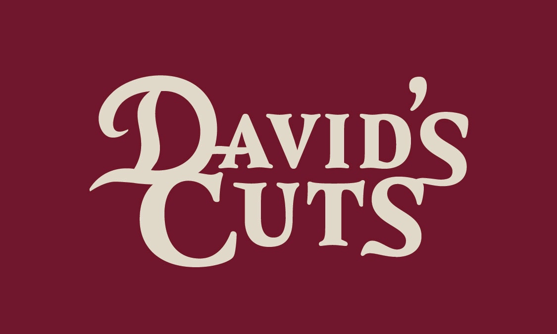
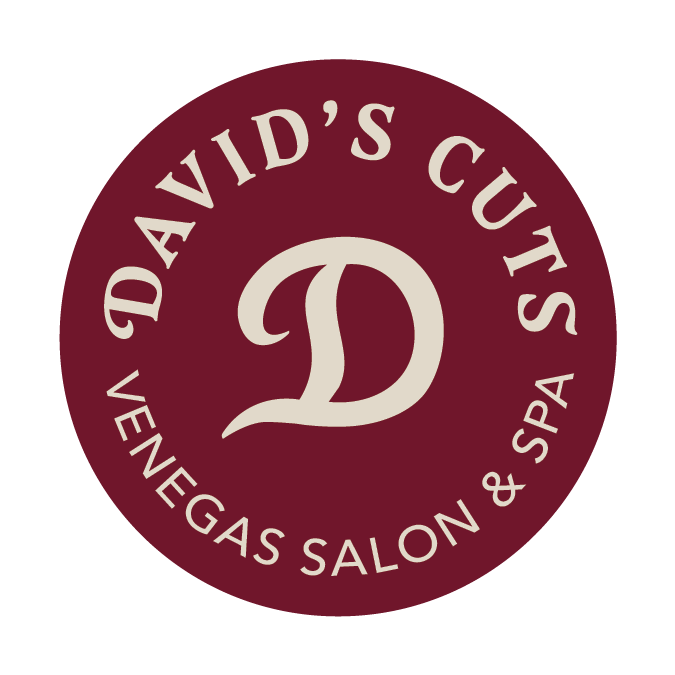
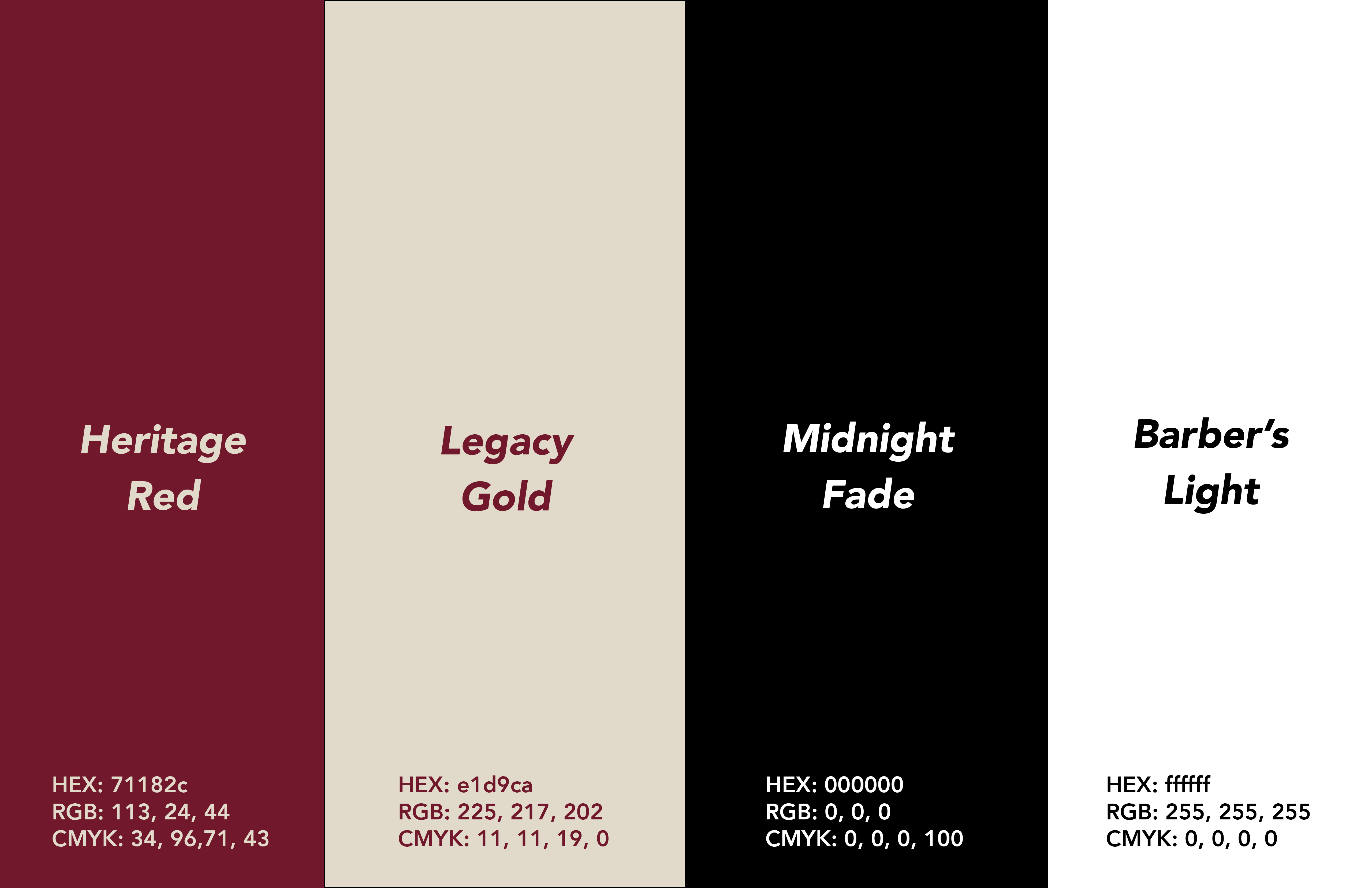
I started off with choosing a typeface that stands out, but not in a way that is too flashy. David wanted a logo that is minimalistic yet still feels luxurious. This is why I chose a red and gold color palette. Both colors feel elegant and elevates his brand. I also wanted to create a logo mark that will be easily recognizable in smaller formats such as social media profiles, business cards, stickers, and even future products he might launch for his brand.
LOGO VARIATIONS
COLORED VARIATIONS
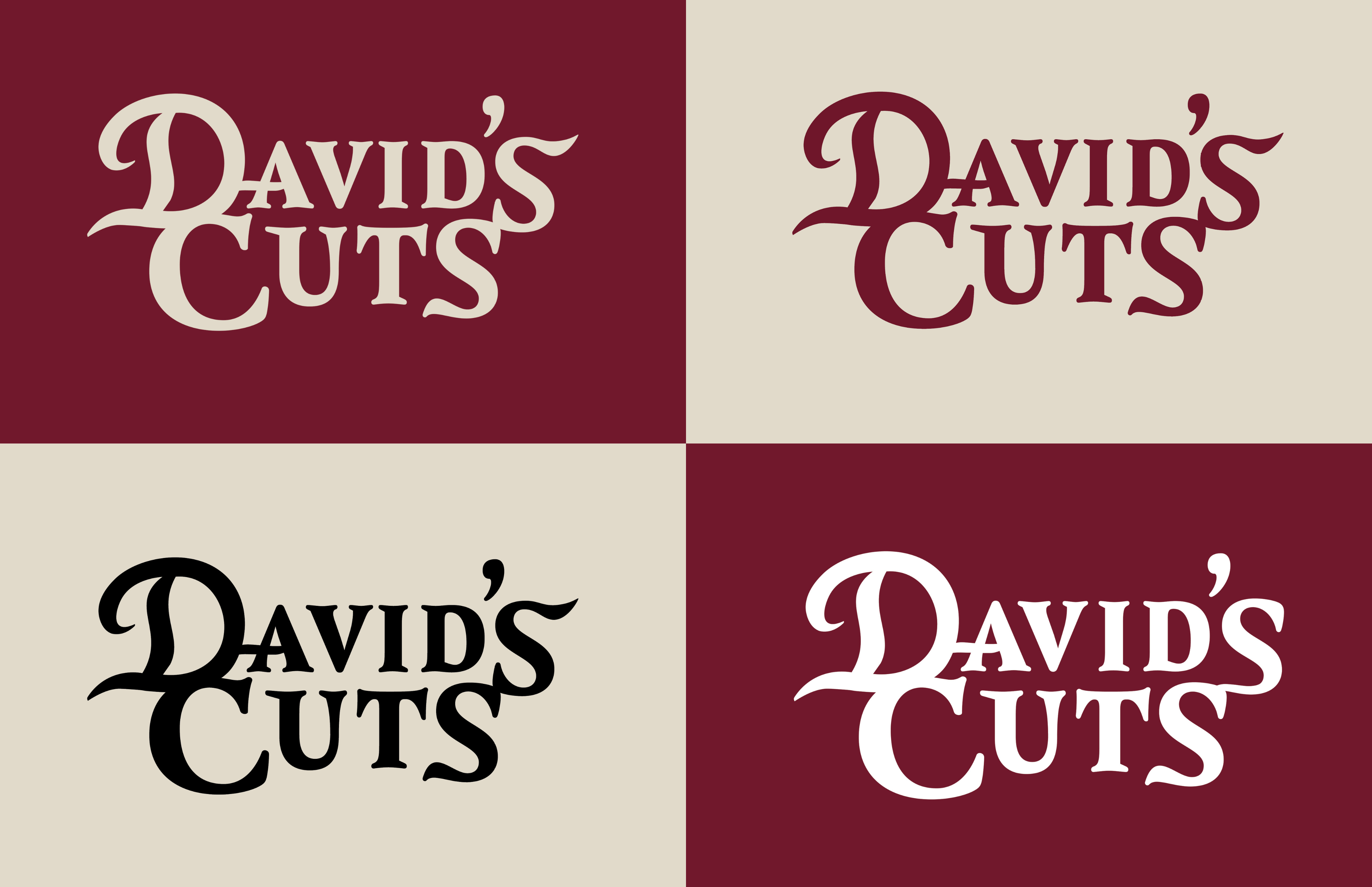
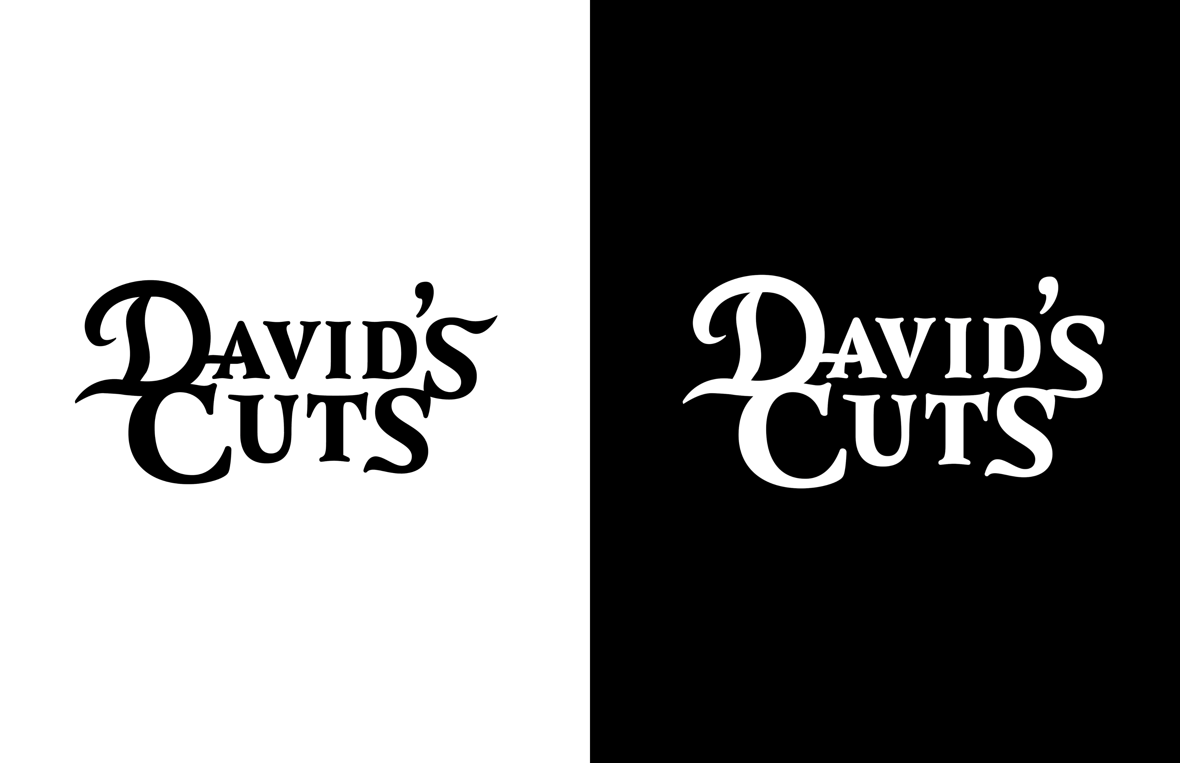
BLACK & WHITE VARIATIONS
COLORS
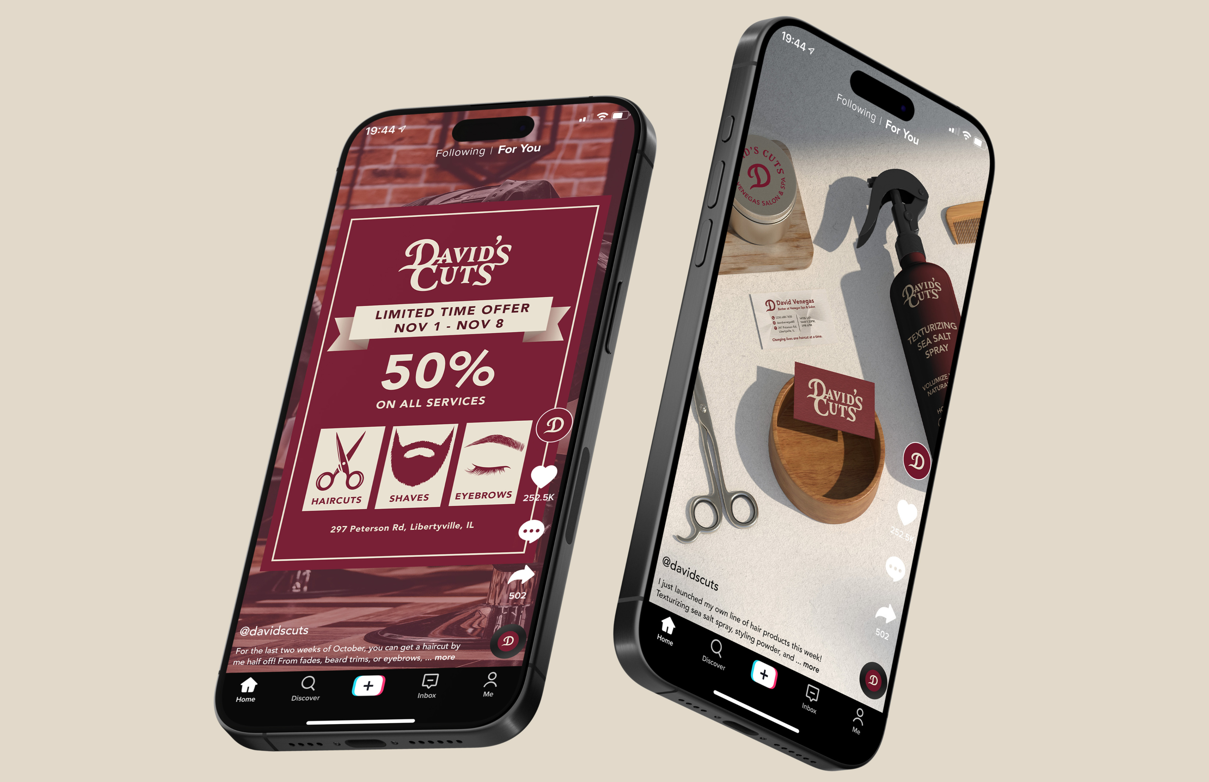
SOCIAL MEDIA PRESENCE
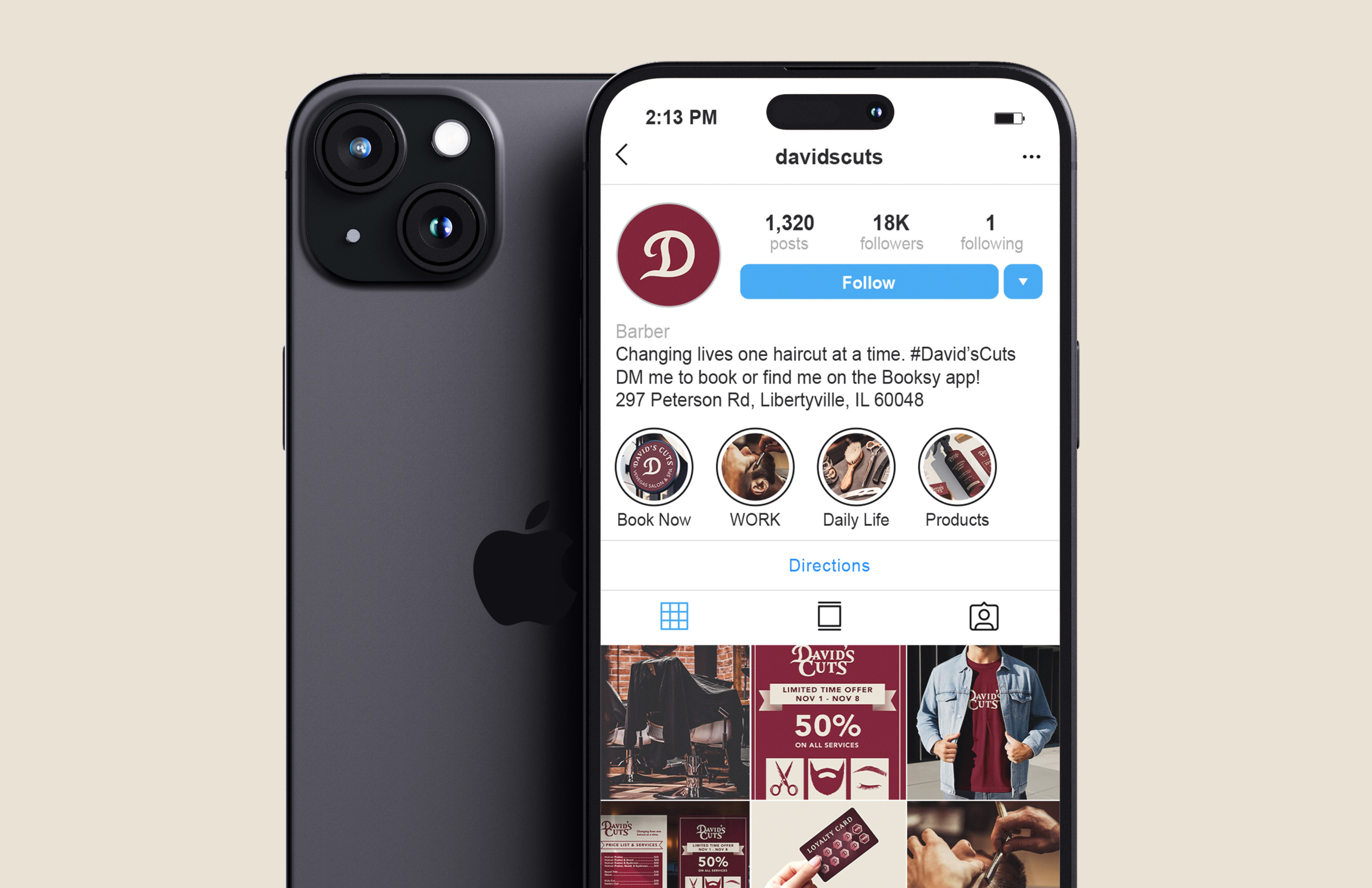
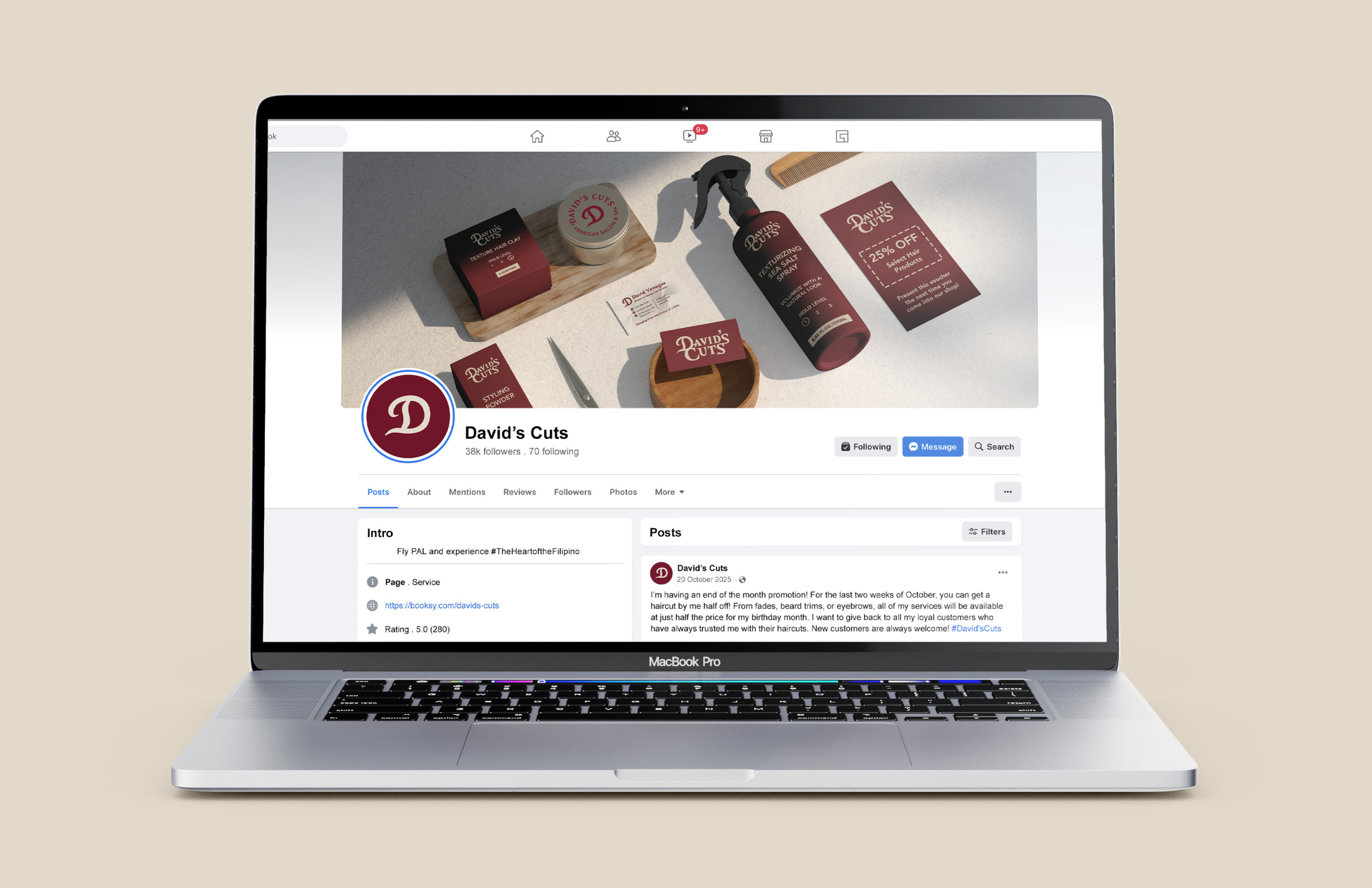
TikTok
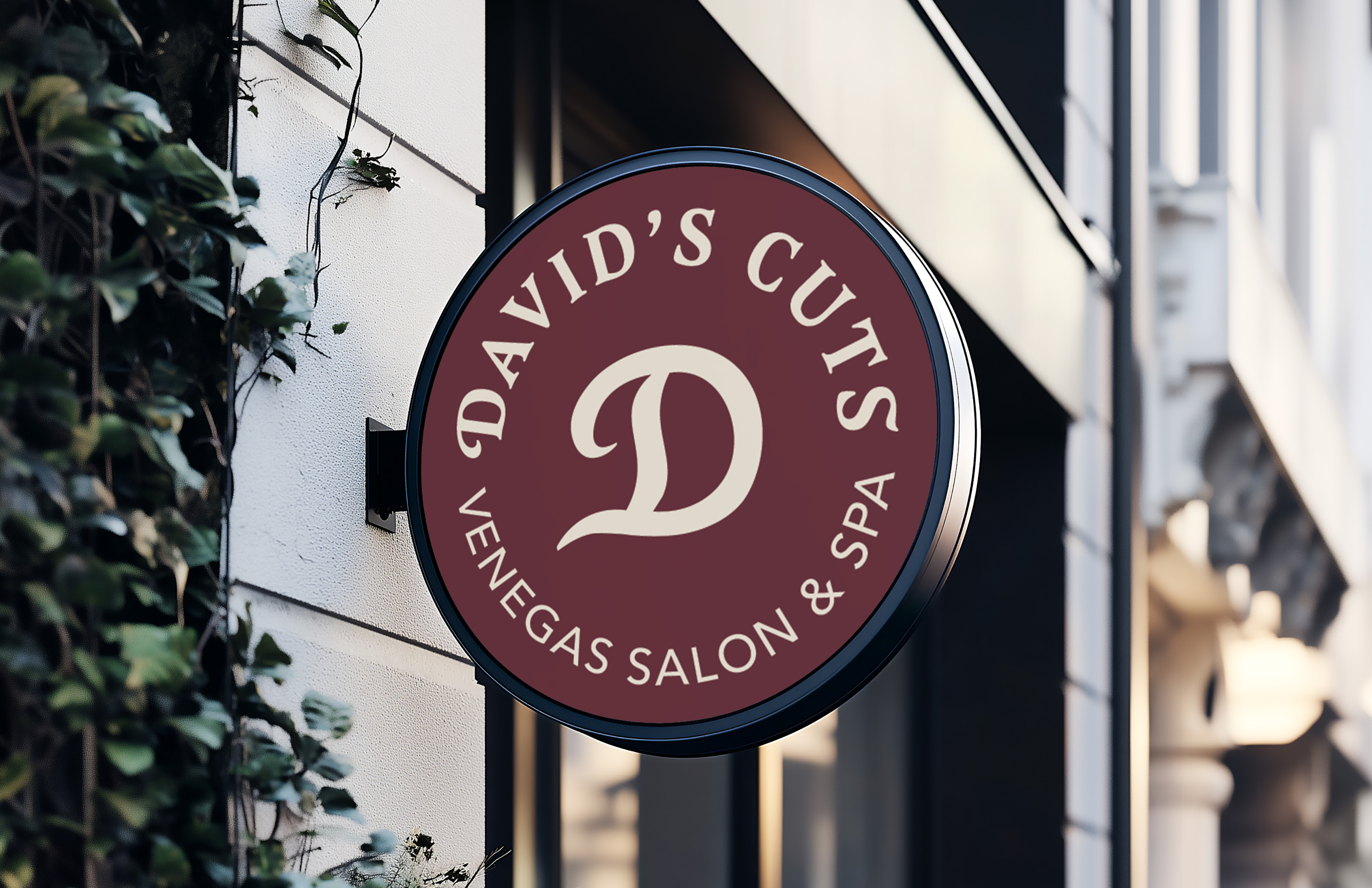
LOGO DESIGN IN ACTION
Poster
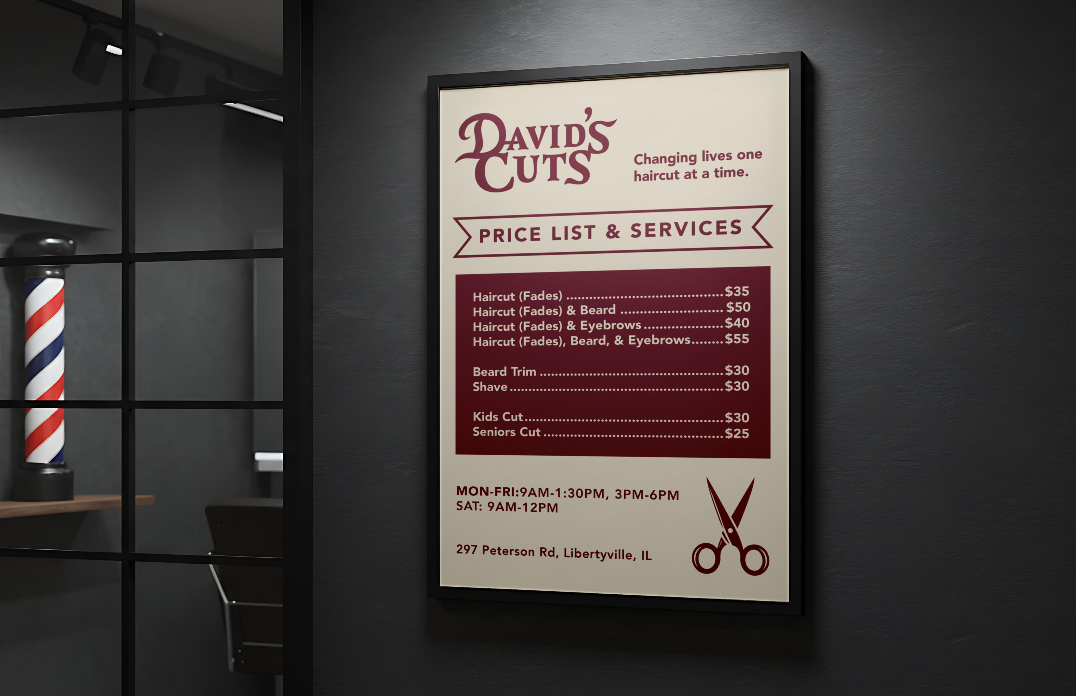
Signage
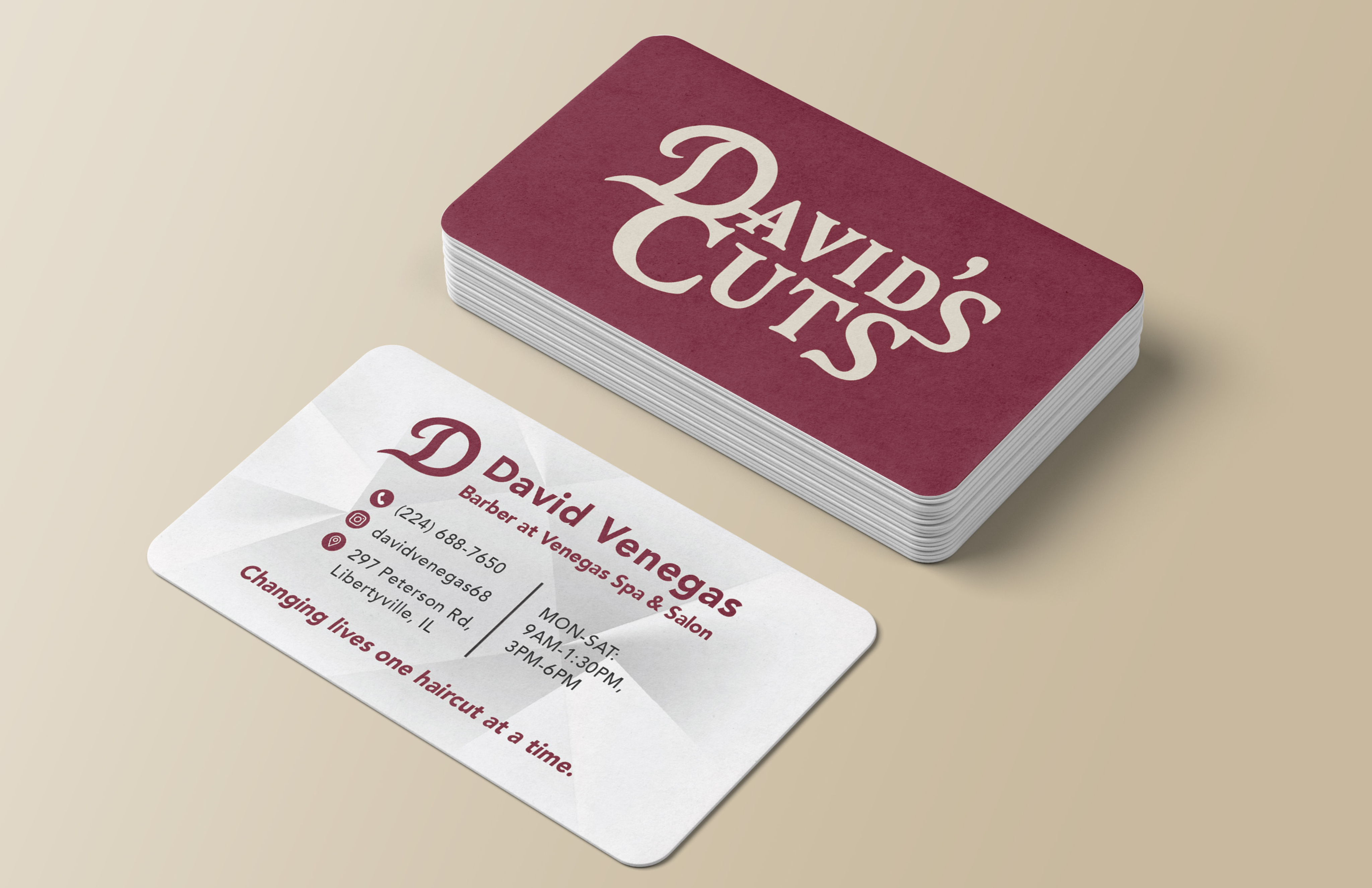
Business Card
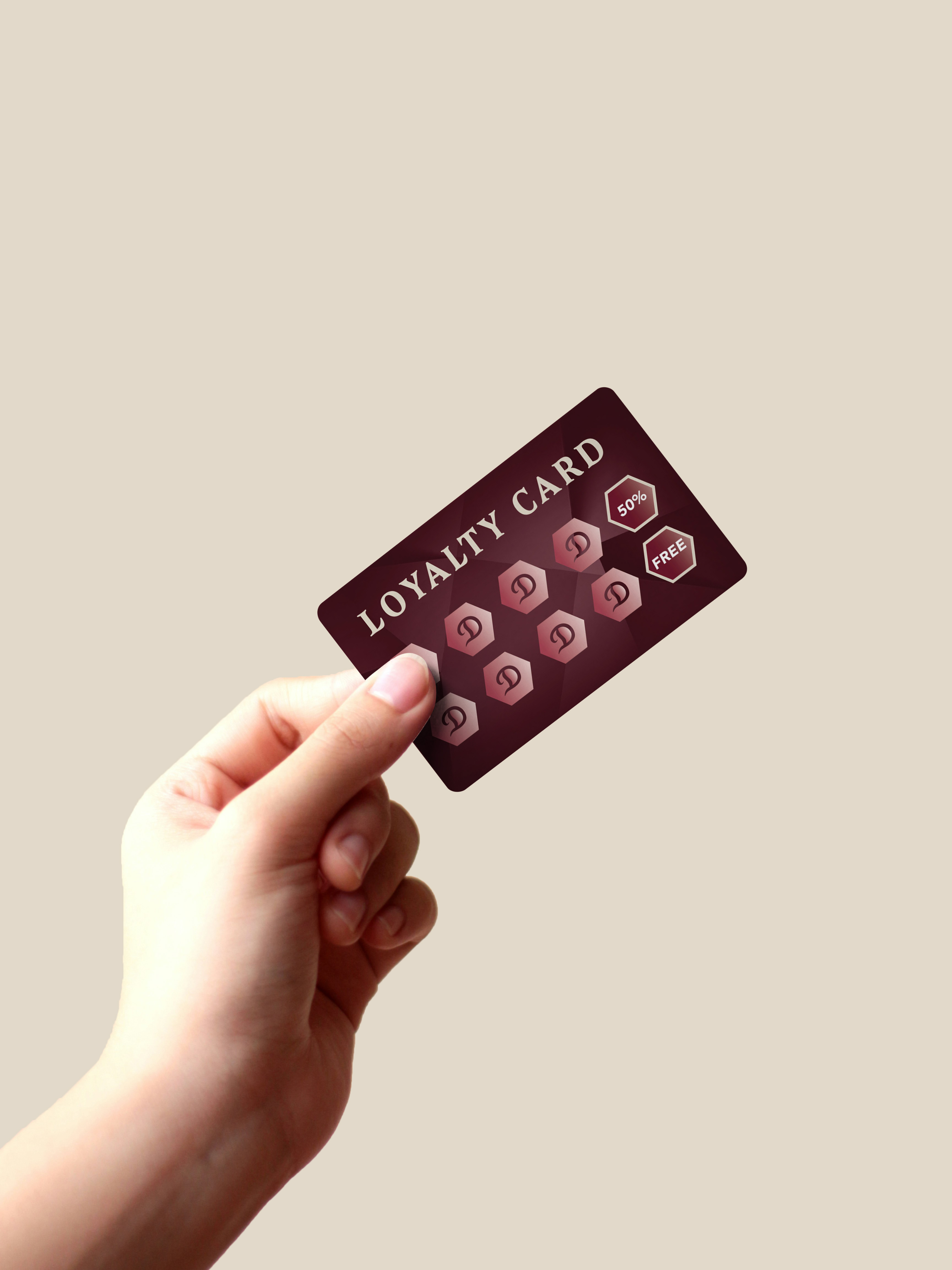
Loyalty Card
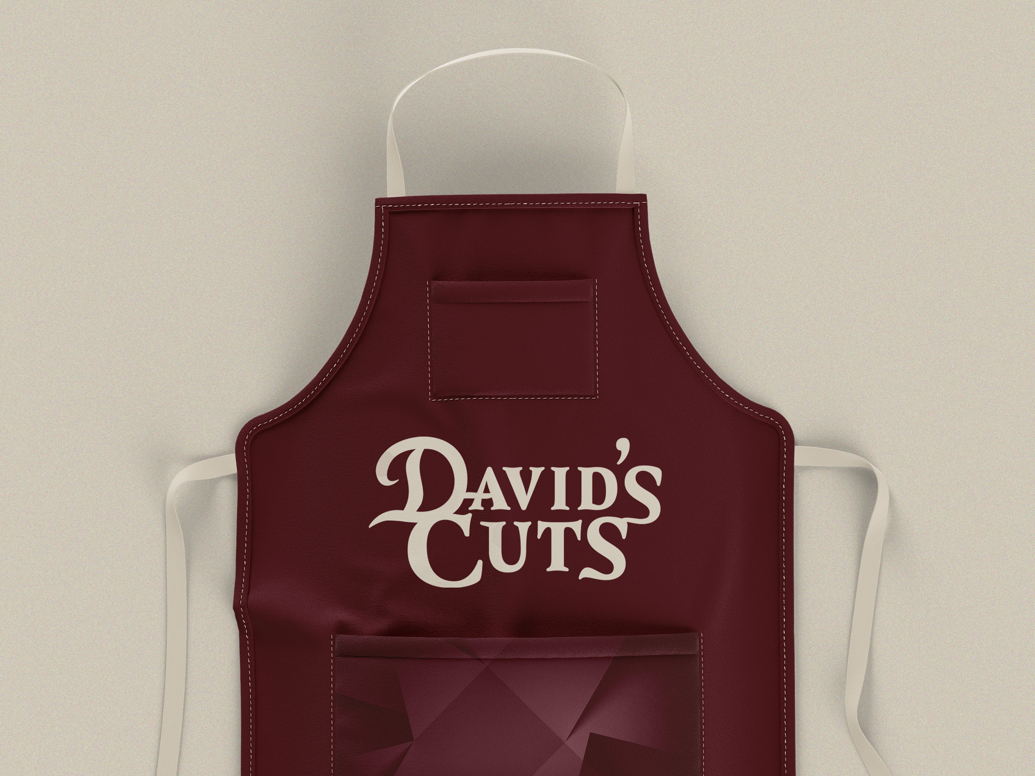
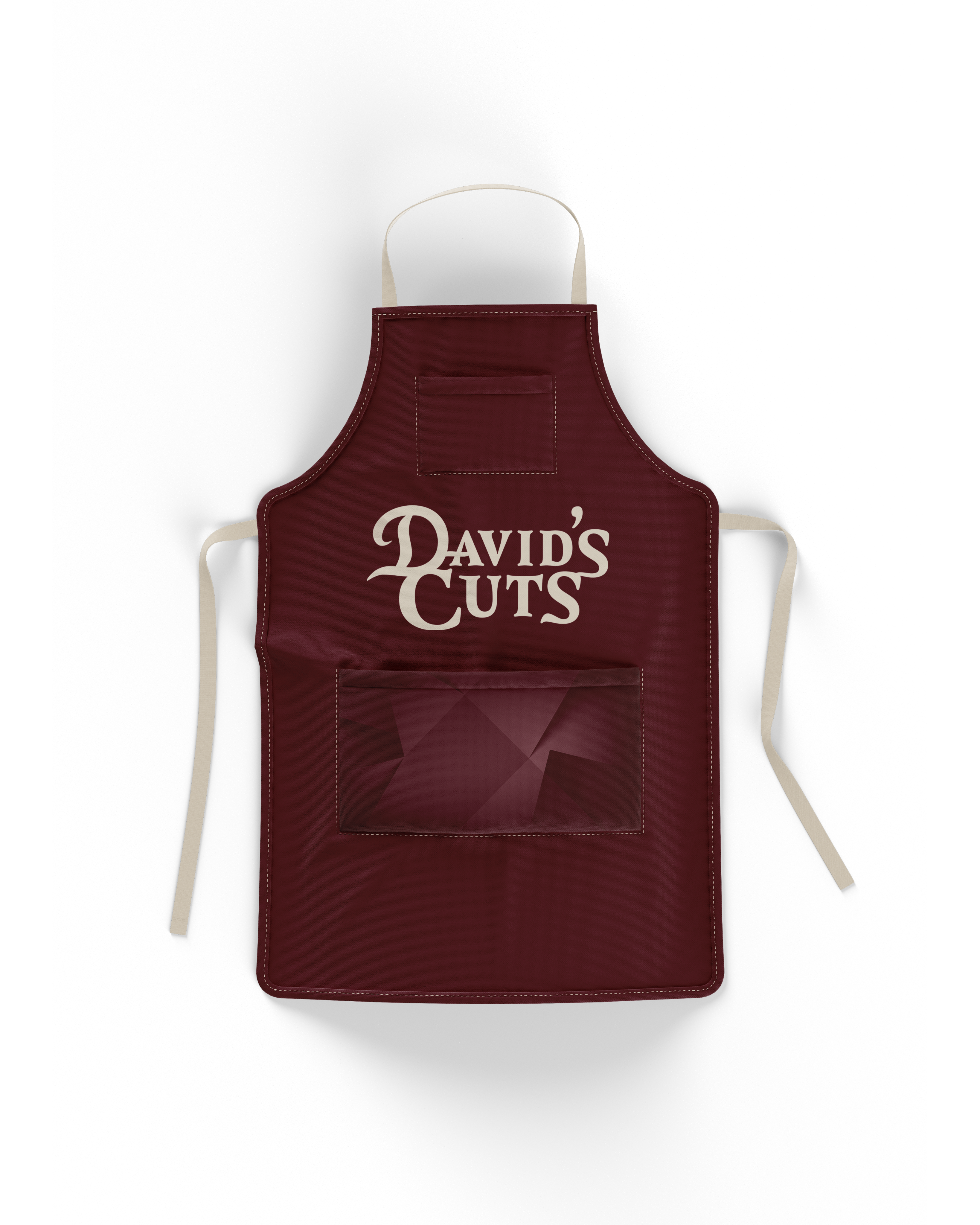
Barber Apron
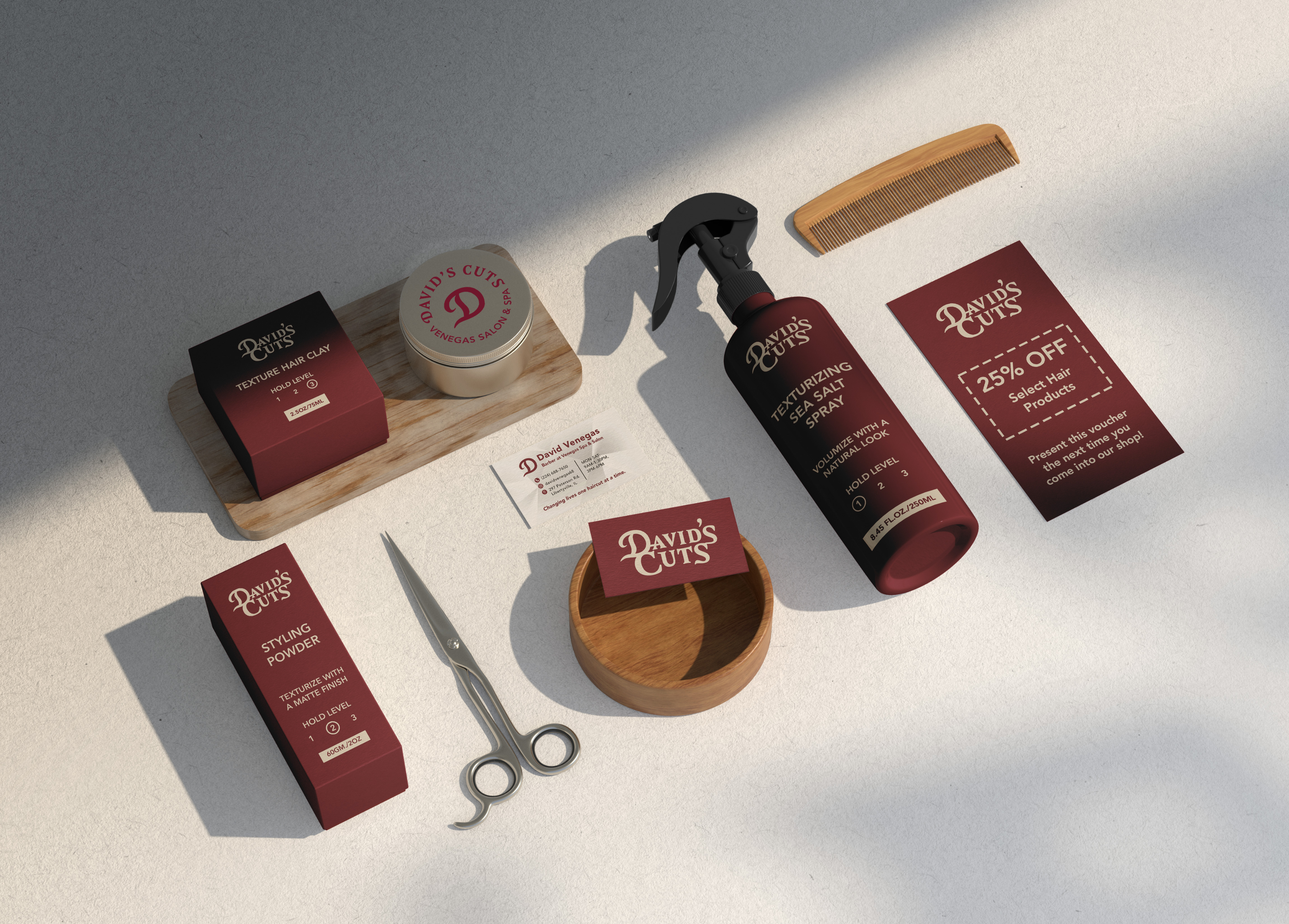
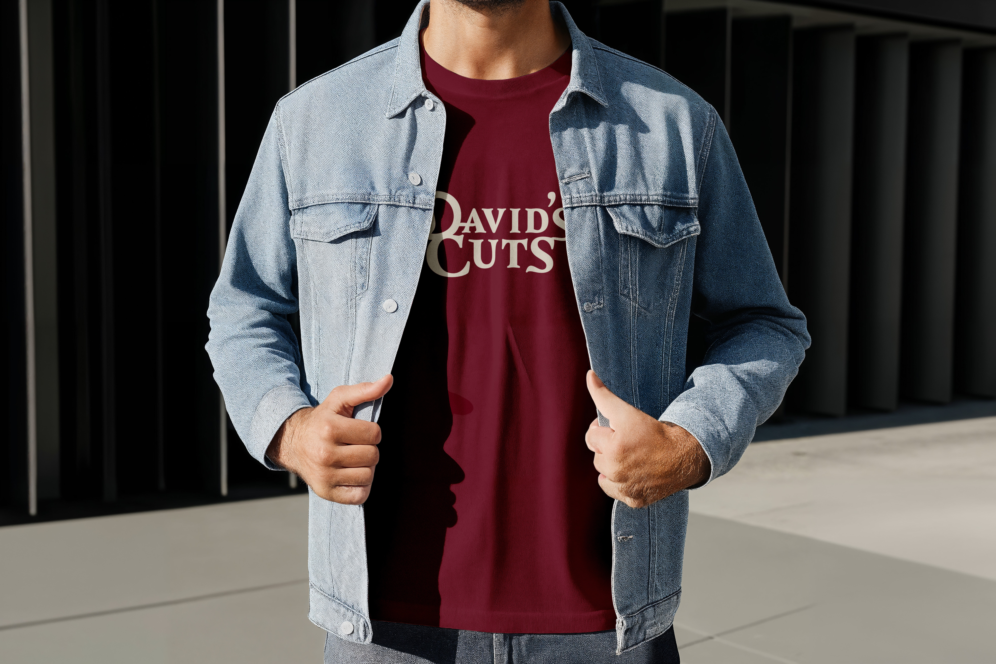
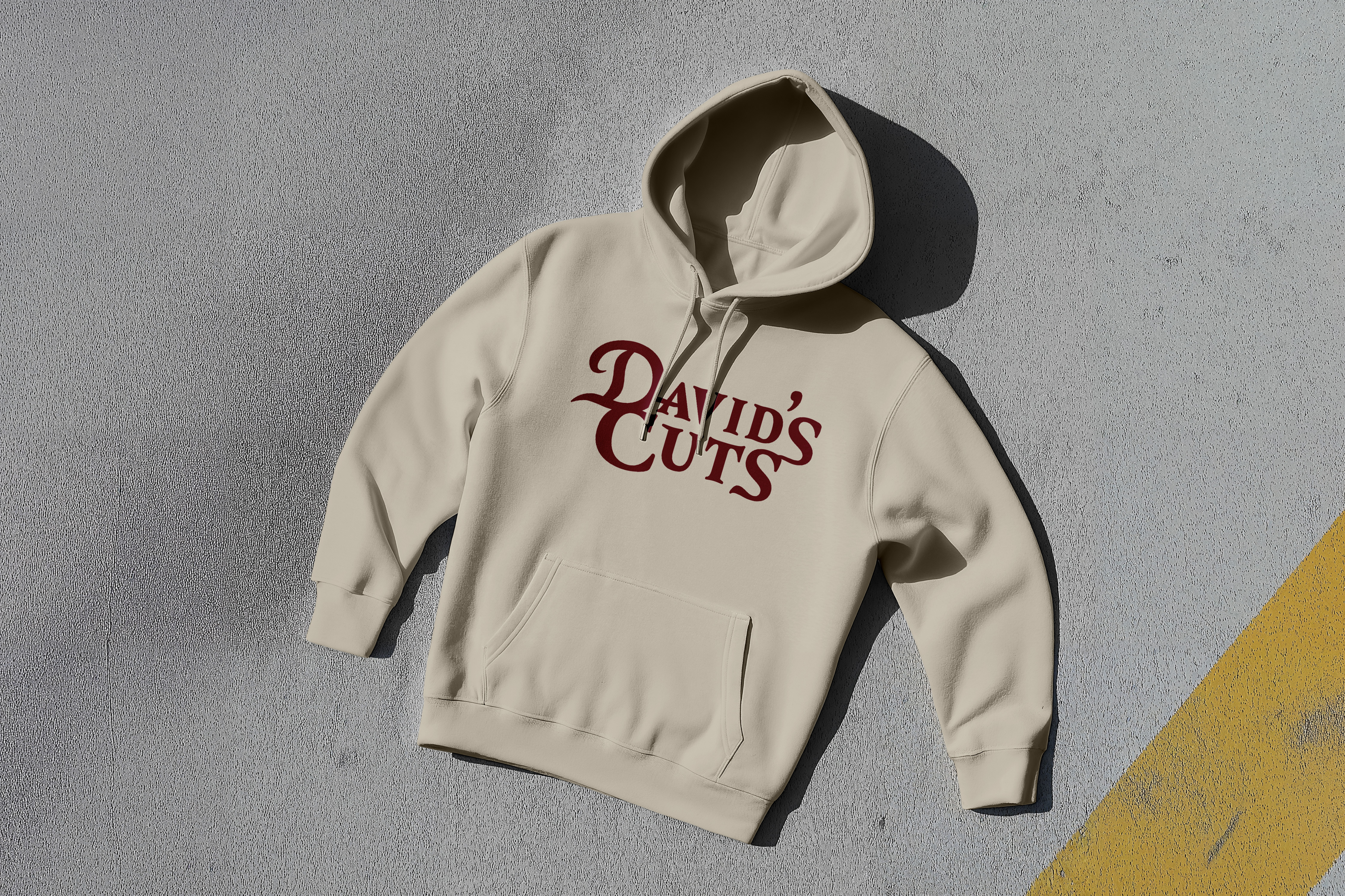
Products
Merchandise
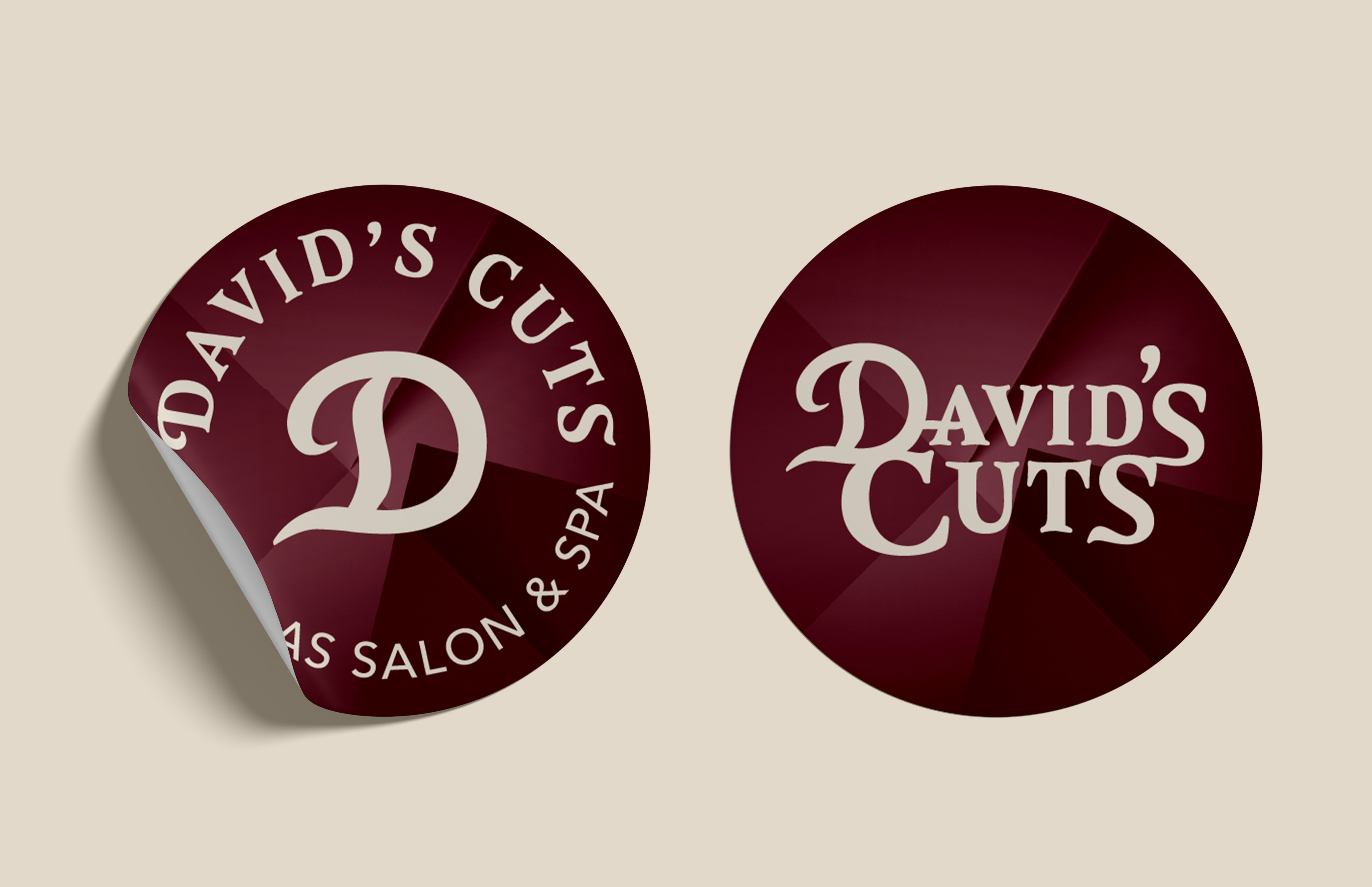
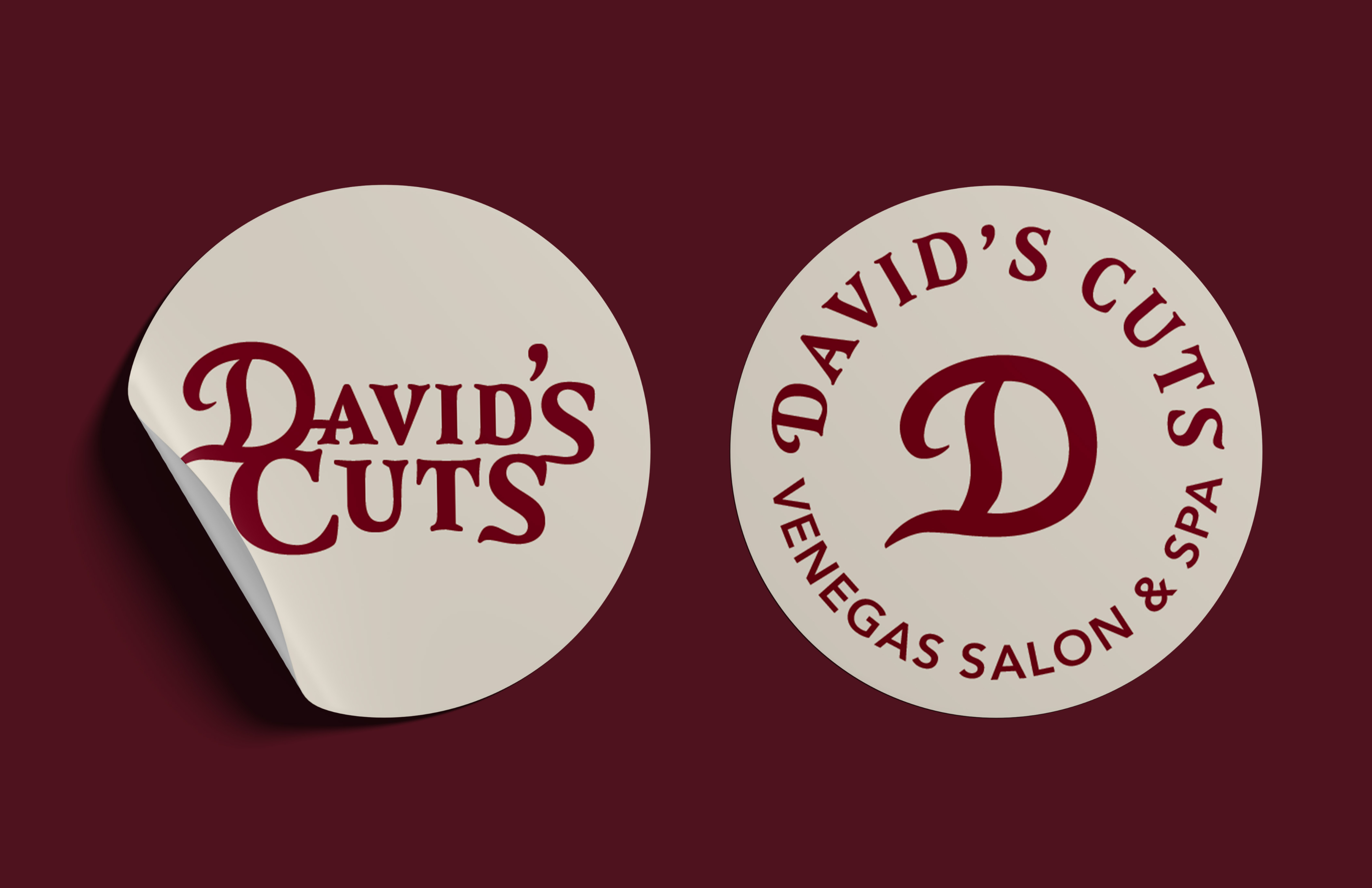
Stickers
ALL WORK
PREVIOUS
NEXT
LET’S GET CREATIVE!
Have inquiries or interested in collaborating? I would love to help design your ideas and make it come to life!
DAVID’S CUTS
NOVEMBER 2025
OVERVIEW
David’s Cuts serves as a self-made brand that embodies commitment, professionalism, and modern services for his diverse clientele. This brand has established itself with its attention to detail, adaptability, integrity, customer service, and craftsmanship.
The purpose of creating a logo for David Venegas and his own brand is to establish his business as a professional barber. Having a logo is crucial for his clients and potential clientele to recognize, remember, and trust him. With a clean, memorable logo, it helps clients identify his name quickly among the many other barbers in the community. This also tells people that David takes his craft seriously and separates him from hobby barbers as a professional worth paying for.
TOOLS USED
Adobe Illustrator
Adobe Photoshop
Adobe InDesign
APPROACH
I started off with choosing a typeface that stands out, but not in a way that is too flashy. David wanted a logo that is minimalistic yet still feels luxurious. This is why I chose a red and gold color palette. Both colors feel elegant and elevates his brand. I also wanted to create a logo mark that will be easily recognizable in smaller formats such as social media profiles, business cards, stickers, and even future products he might launch for his brand.
LOGO VARIATIONS
COLORED VARIATIONS
BLACK & WHITE VARIATIONS
COLOR VARIATIONS
SOCIAL MEDIA PRESENCE
TikTok
LOGO DESIGN IN ACTION
Poster
Signage
Business Card
Loyalty Card
Barber Apron
Products
Merchandise
Stickers
ALL WORK
PREVIOUS
NEXT
LET’S GET CREATIVE!
Have inquiries or interested in collaborating? I would love to help design your ideas and make it come to life!

DAVID’S CUTS
NOVEMBER 2025
OVERVIEW
David’s Cuts serves as a self-made brand that embodies commitment, professionalism, and modern services for his diverse clientele. This brand has established itself with its attention to detail, adaptability, integrity, customer service, and craftsmanship.
The purpose of creating a logo for David Venegas and his own brand is to establish his business as a professional barber. Having a logo is crucial for his clients and potential clientele to recognize, remember, and trust him. With a clean, memorable logo, it helps clients identify his name quickly among the many other barbers in the community. This also tells people that David takes his craft seriously and separates him from hobby barbers as a professional worth paying for.
TOOLS USED
Adobe Illustrator
Adobe Photoshop
Adobe InDesign
APPROACH
I started off with choosing a typeface that stands out, but not in a way that is too flashy. David wanted a logo that is minimalistic yet still feels luxurious. This is why I chose a red and gold color palette. Both colors feel elegant and elevates his brand. I also wanted to create a logo mark that will be easily recognizable in smaller formats such as social media profiles, business cards, stickers, and even future products he might launch for his brand.
LOGO VARIATIONS
COLORED VARIATIONS
BLACK & WHITE VARIATIONS
COLORS
SOCIAL MEDIA PRESENCE
TikTok
LOGO DESIGN IN ACTION
Poster
Signage
Business Card
Loyalty Card
Barber Apron
Products
Merchandise
Stickers
ALL WORK
PREVIOUS
NEXT
LET’S GET CREATIVE!
Have inquiries or interested in collaborating? I would love to help design your ideas and make it come to life!