
BURGER ALLEY
CHICAGO
JUNE 2025
OVERVIEW
Burger Alley Chicago is a casual, chef-driven burger spot located in the South Loop of Chicago. Their vibe is very welcoming with a cozy interior and friendly staff. They emphasize fresh, made-to-order burgers that many describe as flavorful and satisfying. Their logo on the other hand portrays the opposite effect. It consists of a script typeface that is illegible and can go unnoticed especially when looking from across the
street. It can easily be overlooked when walking by and that is why their identity needs an upgrade.
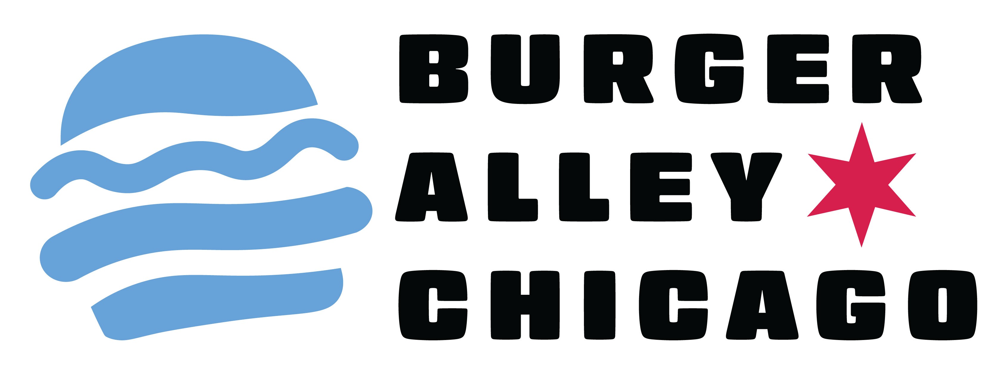
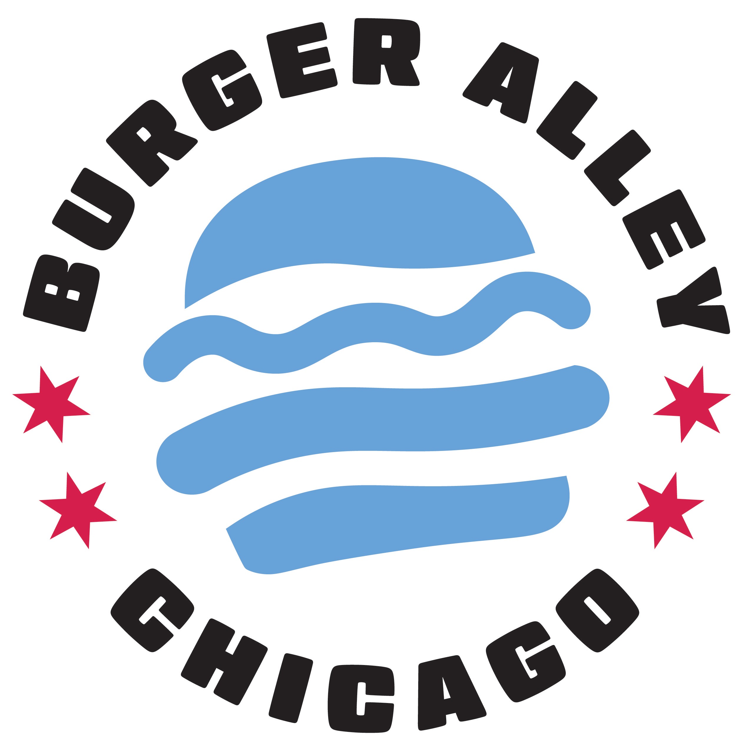
The purpose of this rebrand is to design an updated logo that portrays how confident and passionate they are about their food business. When recreating their brand logo, I wanted to make sure to choose a more modern and bold sans-serif typeface so that legibility is not an issue.
TOOLS USED
Pencil and Paper
Adobe Illustrator
Adobe Photoshop
APPROACH
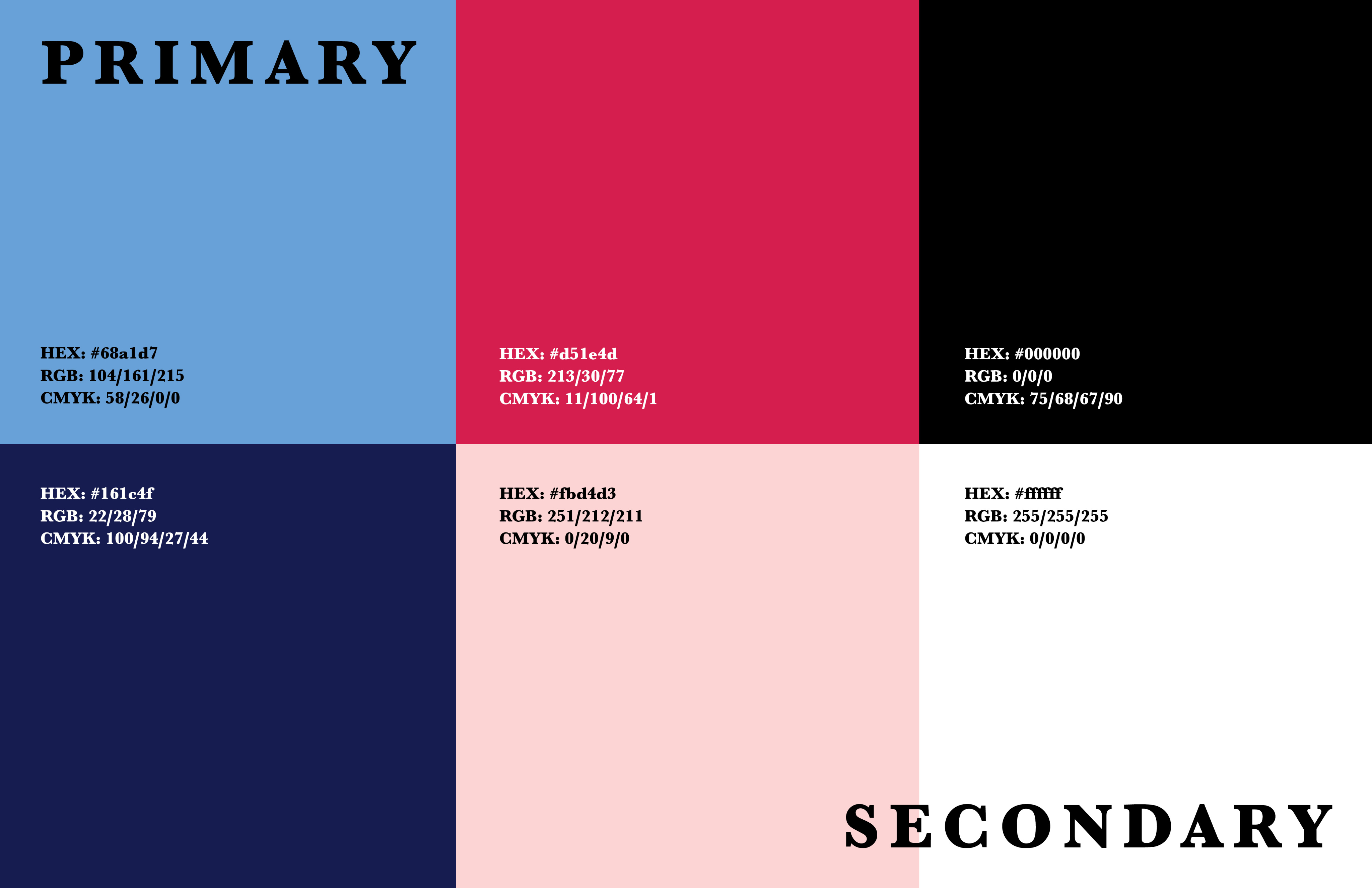
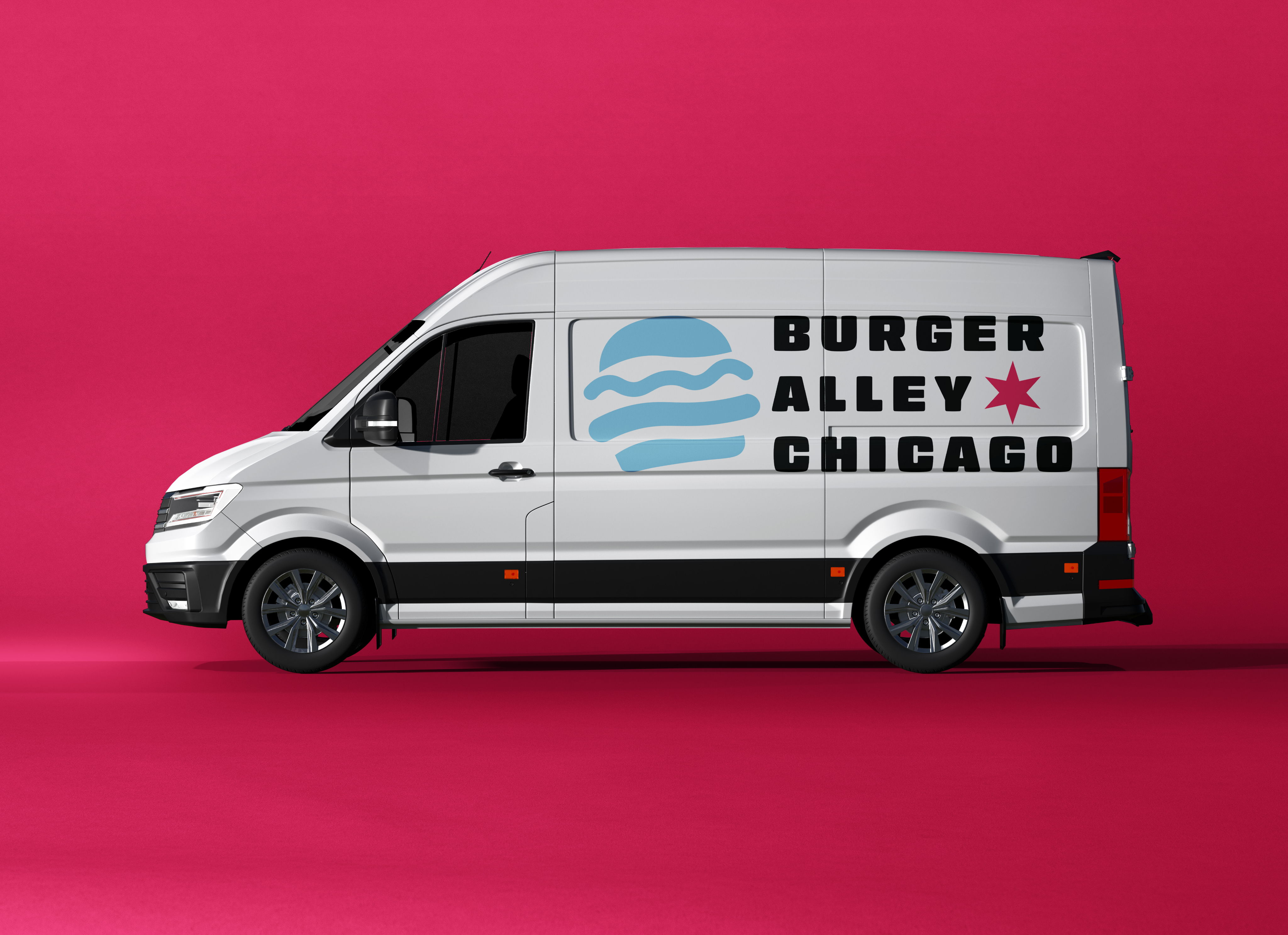
I decided to keep a similar color scheme of blue, red, and white alongside different hues of those colors. This way, it stays true to the Chicago flag that they incorporated into their brand. Their original logo did not really give a burger spot vibe and feel, so with the new logo, I included a burger icon to clearly state what kind of restaurant they are. I also chose a typeface that can catch customers’ attention and amplifies the aesthetic of Burger Alley Chicago. This creates a nice way for them to use various signage without sacrificing the legibility of their logo.
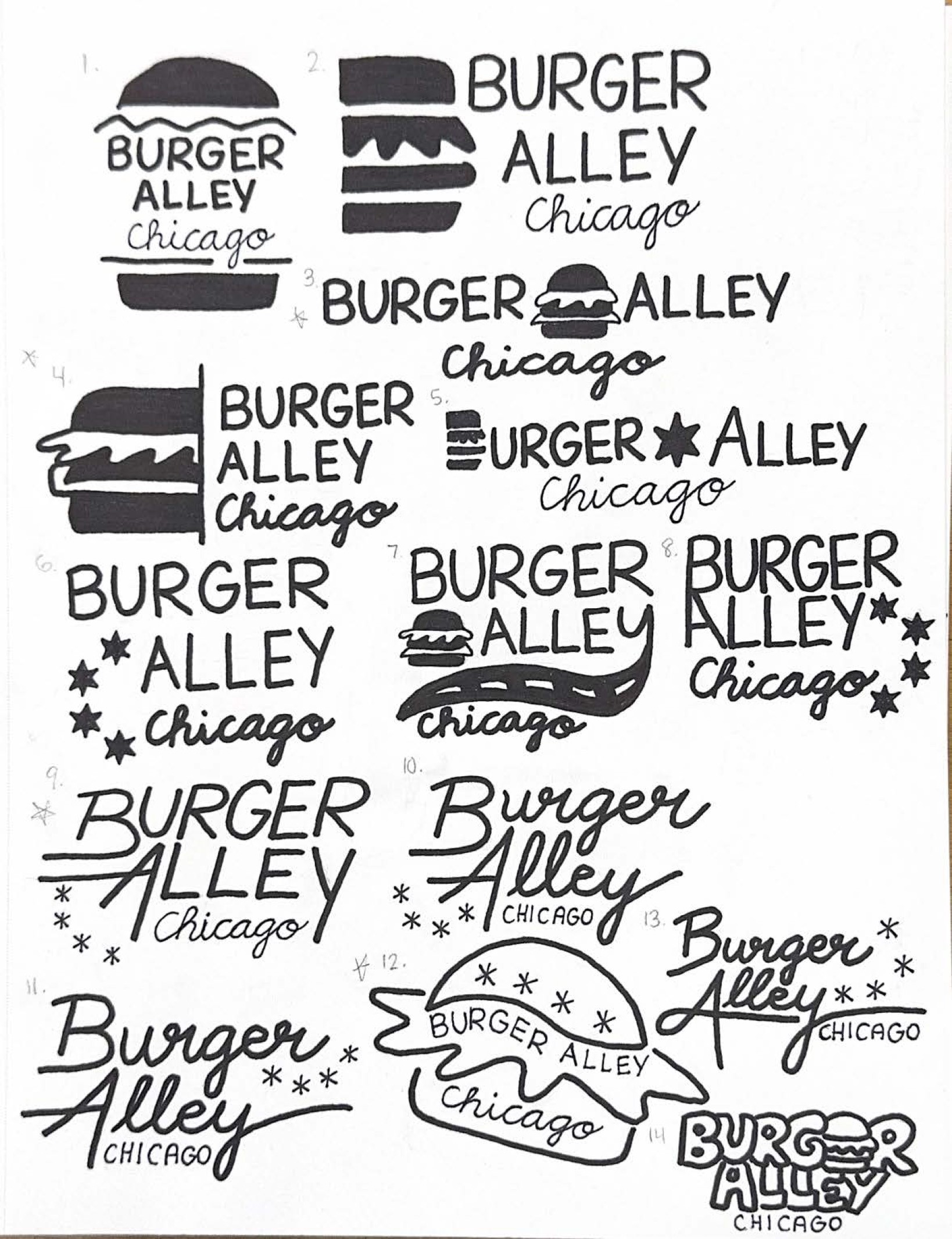
SKETCHES
COLORS
LOGO VARIATIONS

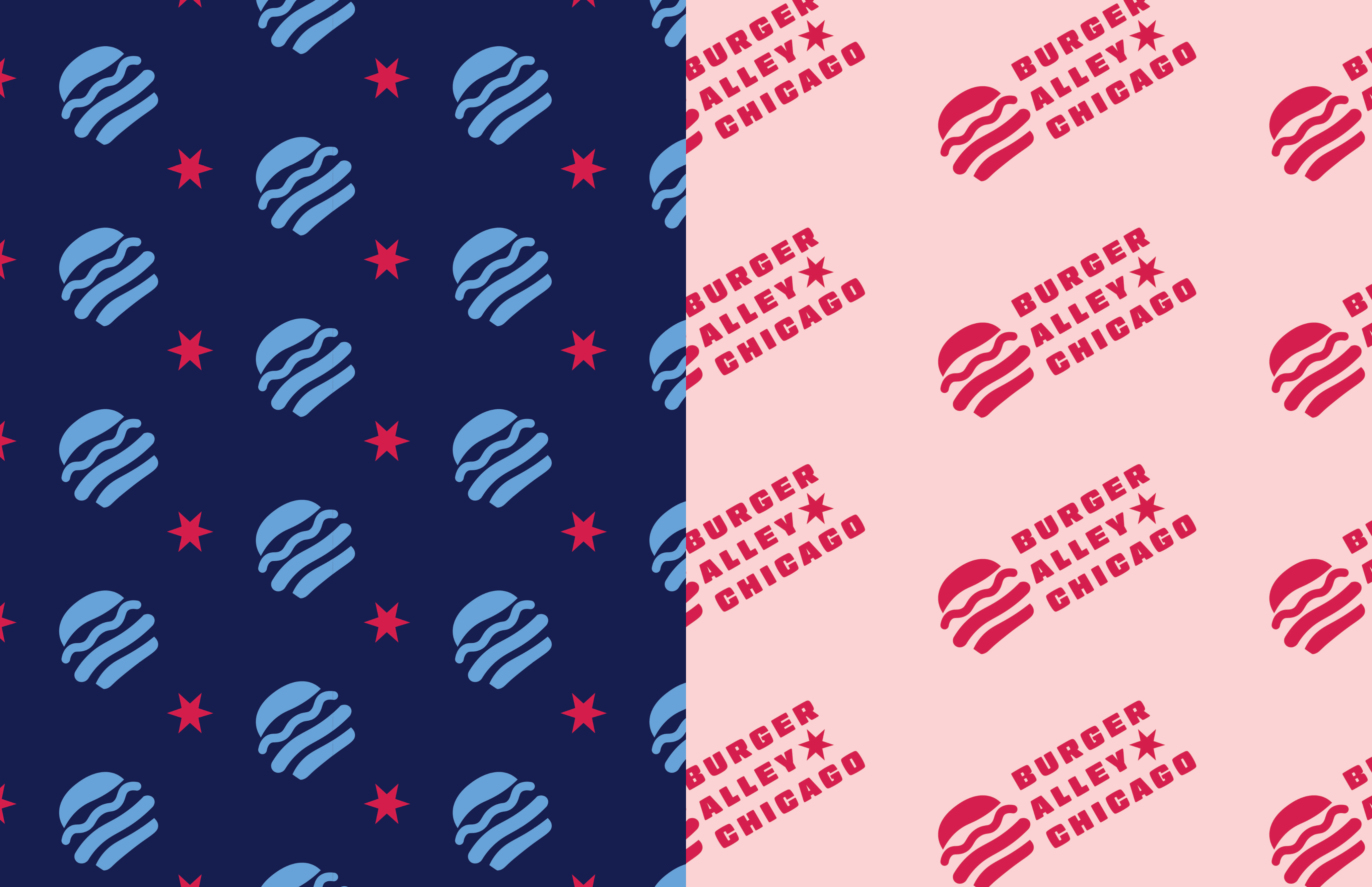
PATTERNS
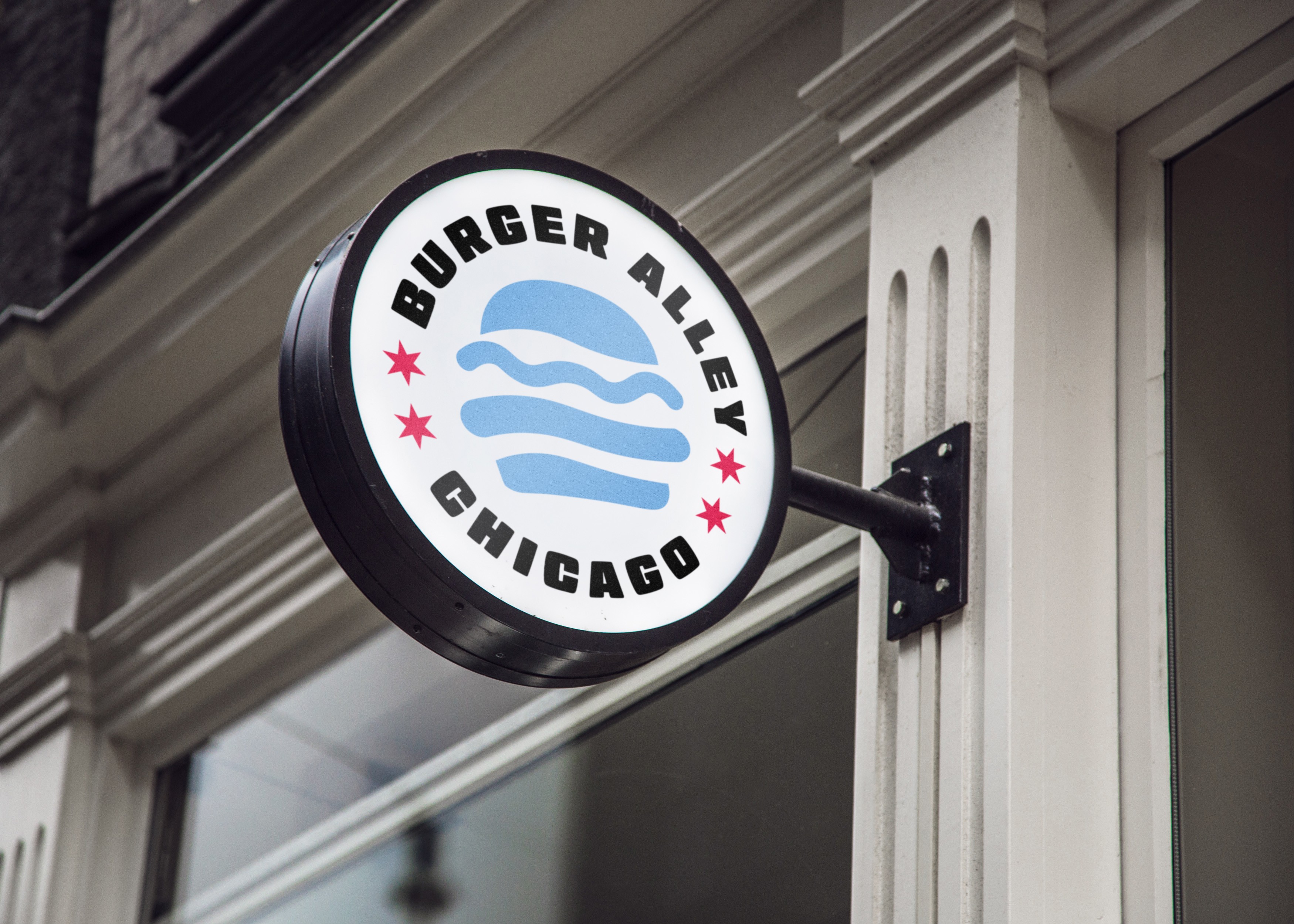
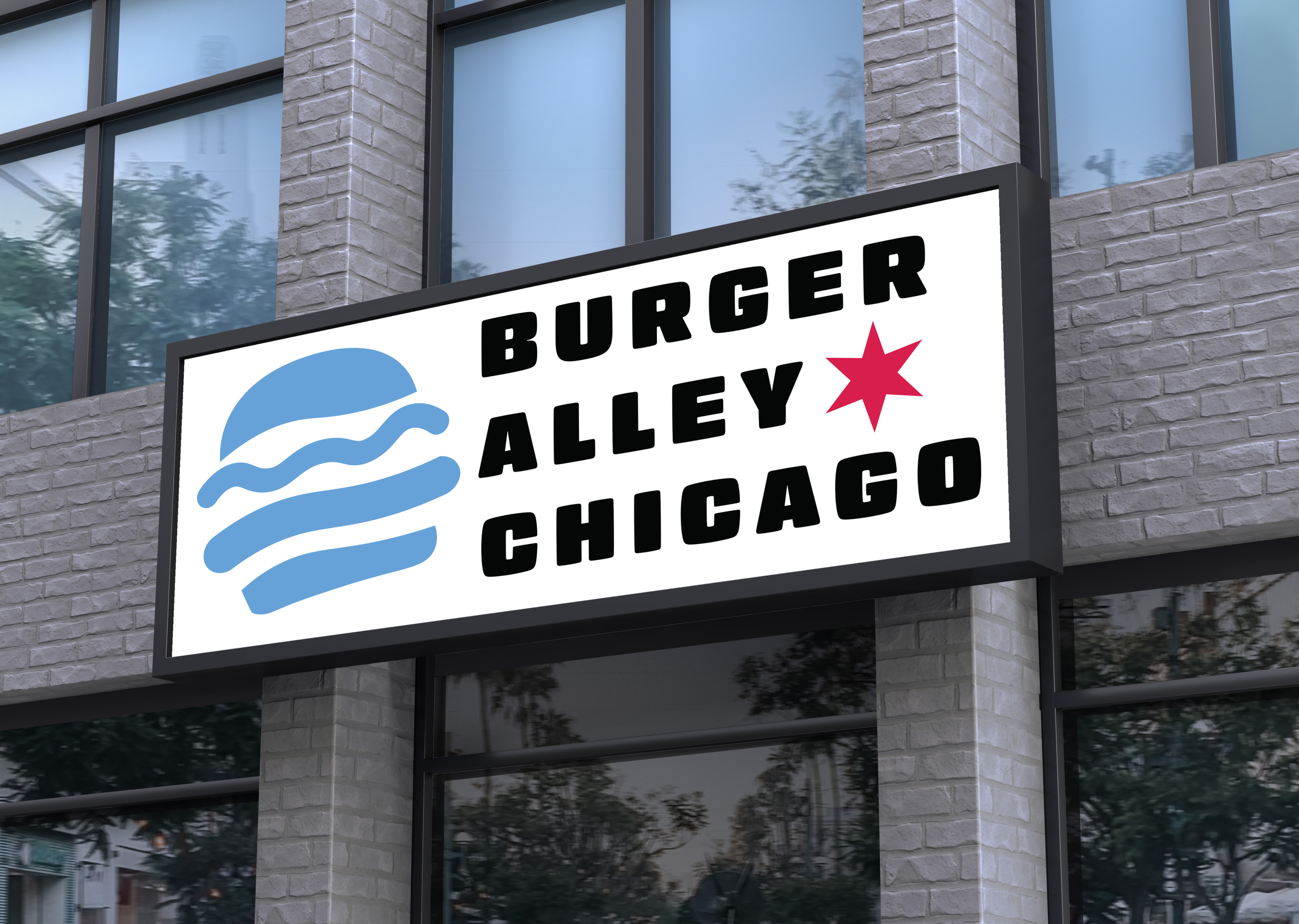
SIGNAGES
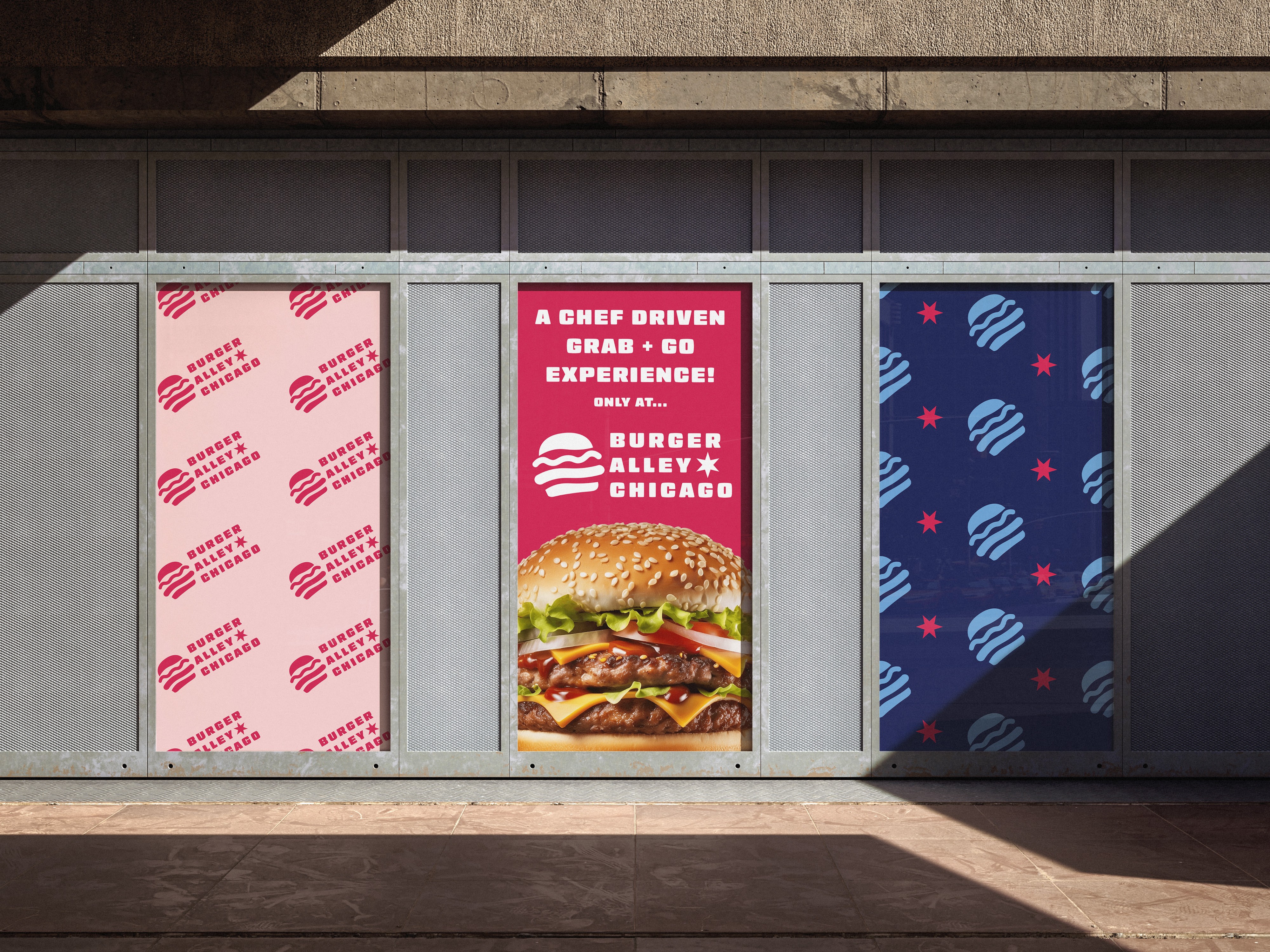
PUBLIC ADVERTISEMENTS
DESIGNS IN ACTION
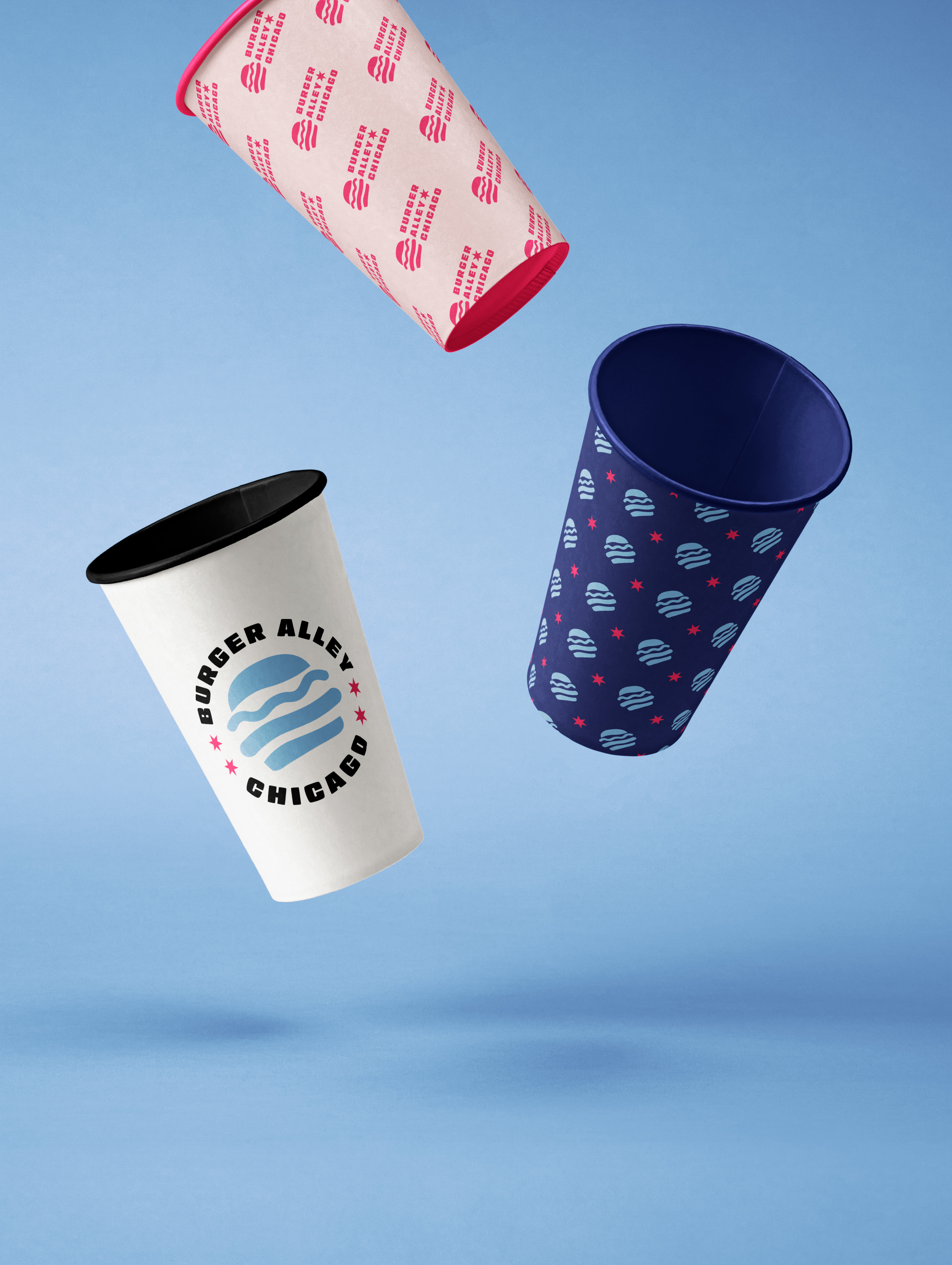
Cups
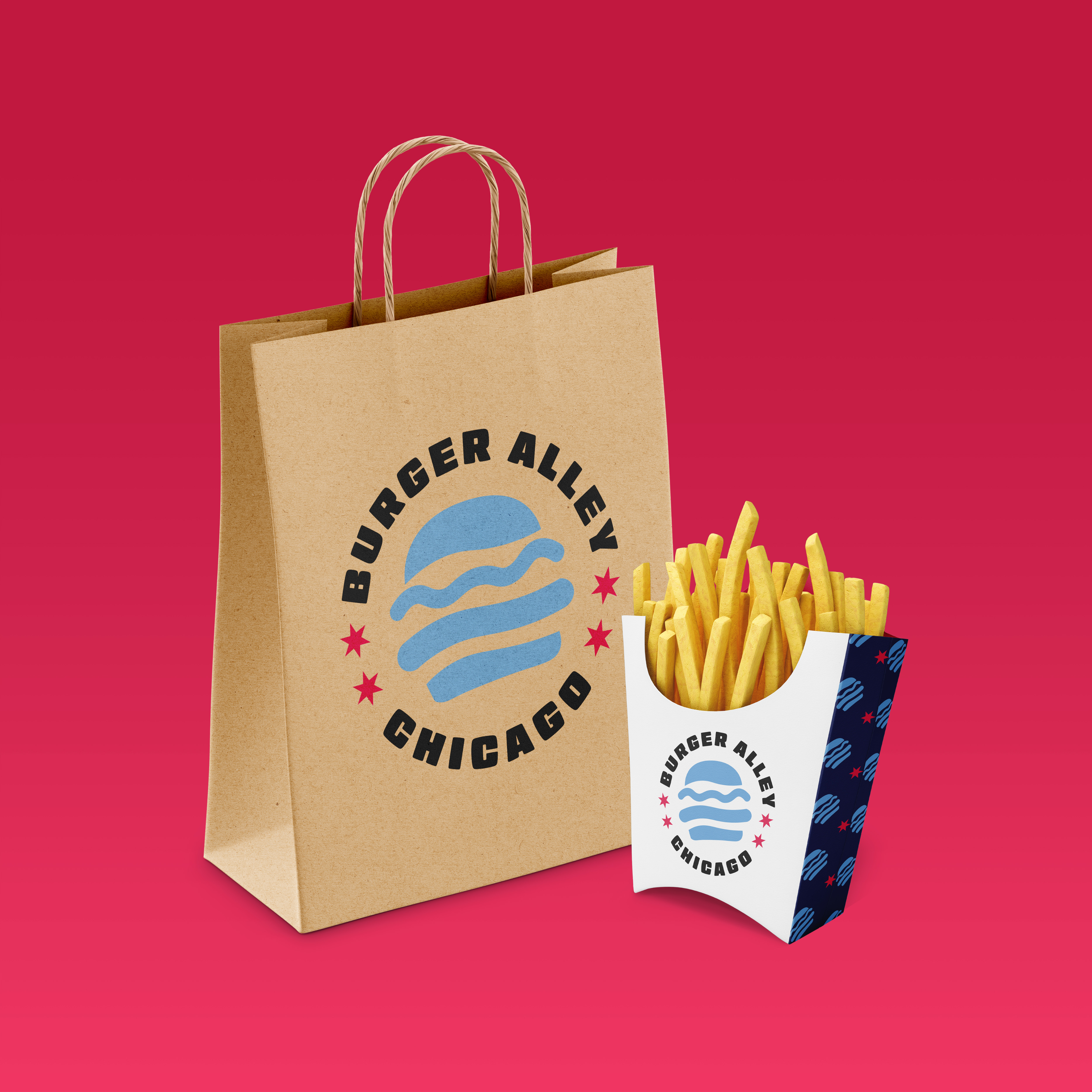
Paper Bag & French Fries Holder
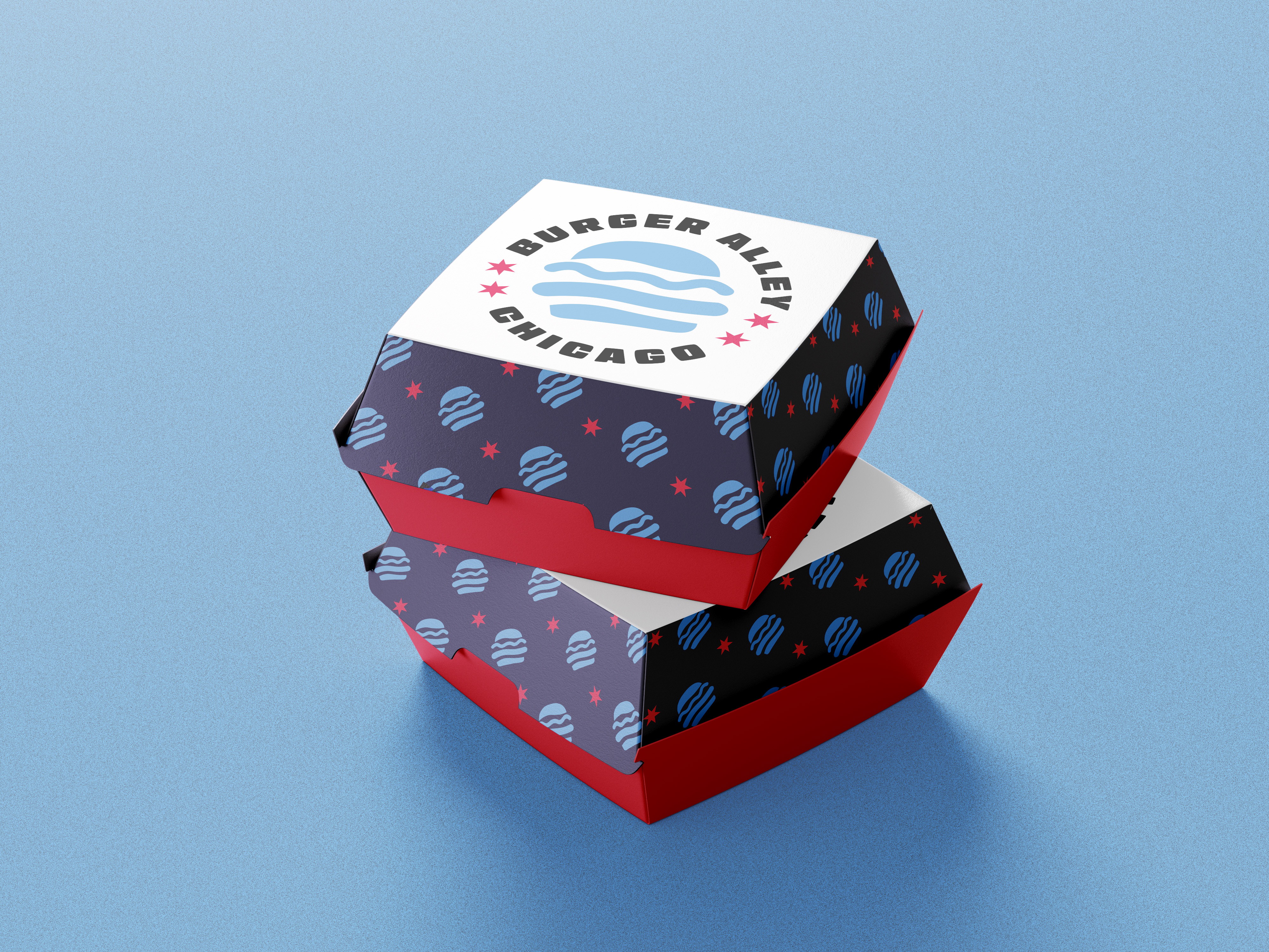
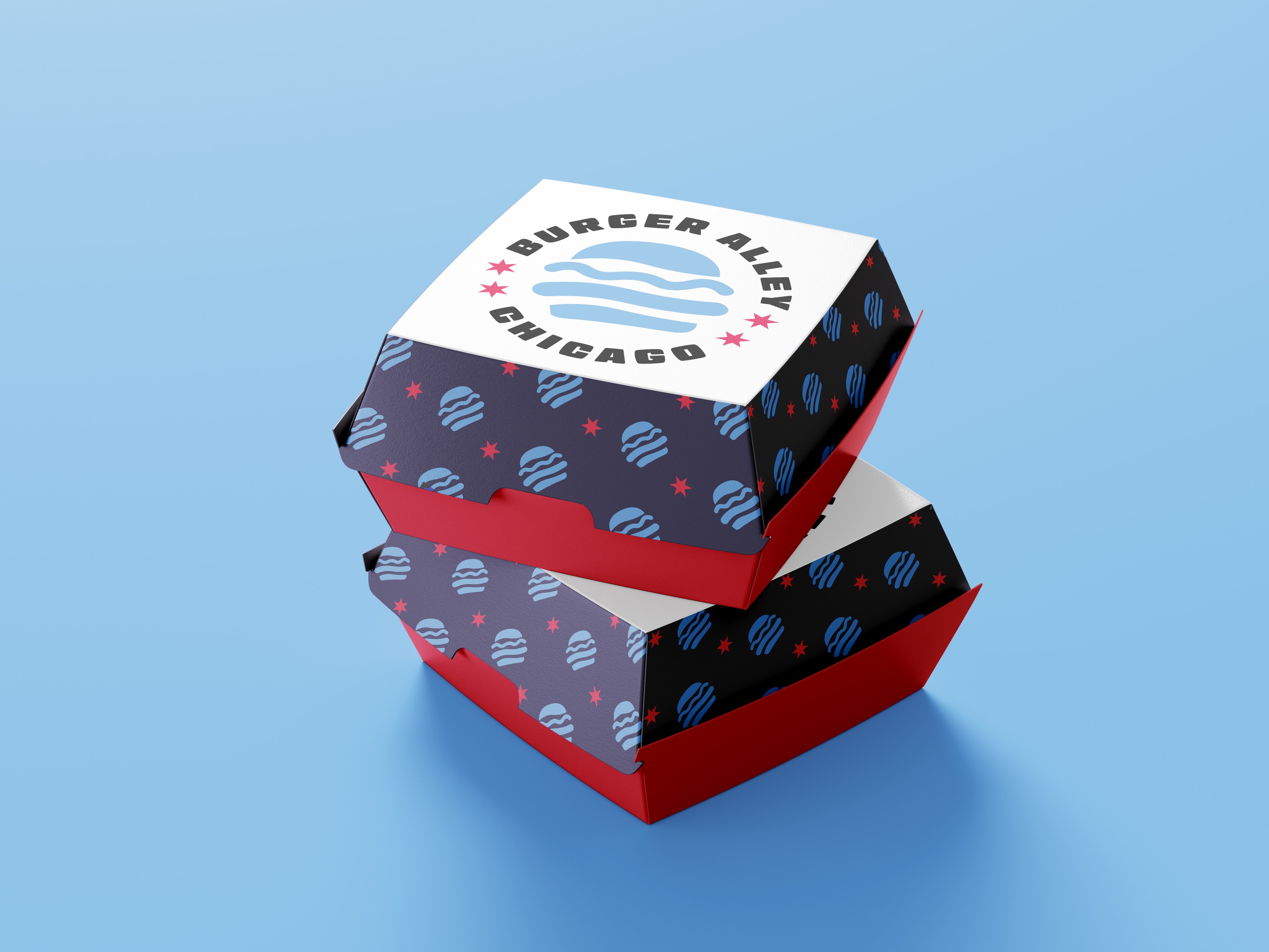
Burger Box
Van Decal
ALL WORK
PREVIOUS
NEXT
LET’S GET CREATIVE!
Have inquiries or interested in collaborating? I would love to help design your ideas and make it come to life!
BURGER ALLEY
CHICAGO
JUNE 2025
OVERVIEW
Burger Alley Chicago is a casual, chef-driven burger spot located in the South Loop of Chicago. Their vibe is very welcoming with a cozy interior and friendly staff. They emphasize fresh, made-to-order burgers that many describe as flavorful and satisfying. Their logo on the other hand portrays the opposite effect. It consists of a script typeface that is illegible and can go unnoticed especially when looking from across the
street. It can easily be overlooked when walking by and that is why their identity needs an upgrade.
The purpose of this rebrand is to design an updated logo that portrays how confident and passionate they are about their food business. When recreating their brand logo, I wanted to make sure to choose a more modern and bold sans-serif typeface so that legibility is not an issue.
TOOLS USED
Pencil and Paper
Adobe Illustrator
Adobe Photoshop
APPROACH
I decided to keep a similar color scheme of blue, red, and white alongside different hues of those colors. This way, it stays true to the Chicago flag that they incorporated into their brand. Their original logo did not really give a burger spot vibe and feel, so with the new logo, I included a burger icon to clearly state what kind of restaurant they are. I also chose a typeface that can catch customers’ attention and amplifies the aesthetic of Burger Alley Chicago. This creates a nice way for them to use various signage without sacrificing the legibility of their logo.
SKETCHES
COLORS
LOGO VARIATIONS
PATTERNS
SIGNAGES
PUBLIC ADVERTISEMENTS
DESIGNS IN ACTION
Cups
Paper Bag & French Fries Holder
Burger Box
Van Decal
ALL WORK
PREVIOUS
NEXT
LET’S GET CREATIVE!
Have inquiries or interested in collaborating? I would love to help design your ideas and make it come to life!

BURGER ALLEY CHICAGO
JUNE 2025
OVERVIEW
Burger Alley Chicago is a casual, chef-driven burger spot located in the South Loop of Chicago. Their vibe is very welcoming with a cozy interior and friendly staff. They emphasize fresh, made-to-order burgers that many describe as flavorful and satisfying. Their logo on the other hand portrays the opposite effect. It consists of a script typeface that is illegible and can go unnoticed especially when looking from across the
street. It can easily be overlooked when walking by and that is why their identity needs an upgrade.
The purpose of this rebrand is to design an updated logo that portrays how confident and passionate they are about their food business. When recreating their brand logo, I wanted to make sure to choose a more modern and bold sans-serif typeface so that legibility is not an issue.
TOOLS USED
Pencil and Paper
Adobe Illustrator
Adobe Photoshop
APPROACH
I decided to keep a similar color scheme of blue, red, and white alongside different hues of those colors. This way, it stays true to the Chicago flag that they incorporated into their brand. Their original logo did not really give a burger spot vibe and feel, so with the new logo, I included a burger icon to clearly state what kind of restaurant they are. I also chose a typeface that can catch customers’ attention and amplifies the aesthetic of Burger Alley Chicago. This creates a nice way for them to use various signage without sacrificing the legibility of their logo.
SKETCHES
COLORS
LOGO VARIATIONS
PATTERNS
SIGNAGES
PUBLIC ADVERTISEMENTS
DESIGNS IN ACTION
Cups
Paper Bag & French Fries Holder
Burger Box
Van Decal
ALL WORK
PREVIOUS
NEXT
LET’S GET CREATIVE!
Have inquiries or interested in collaborating? I would love to help design your ideas and make it come to life!