
BIGELOW TEA
APRIL 2025
OVERVIEW
Bigelow Tea has stayed true to their heritage by being 100% family owned company. It was founded 80 years ago by Ruth Campbell Bigelow who created their signature tea, “Constant Comment,” which was how the company started. Their product line includes seasonal teas, cold brew, organic, wellness, and immune support teas.
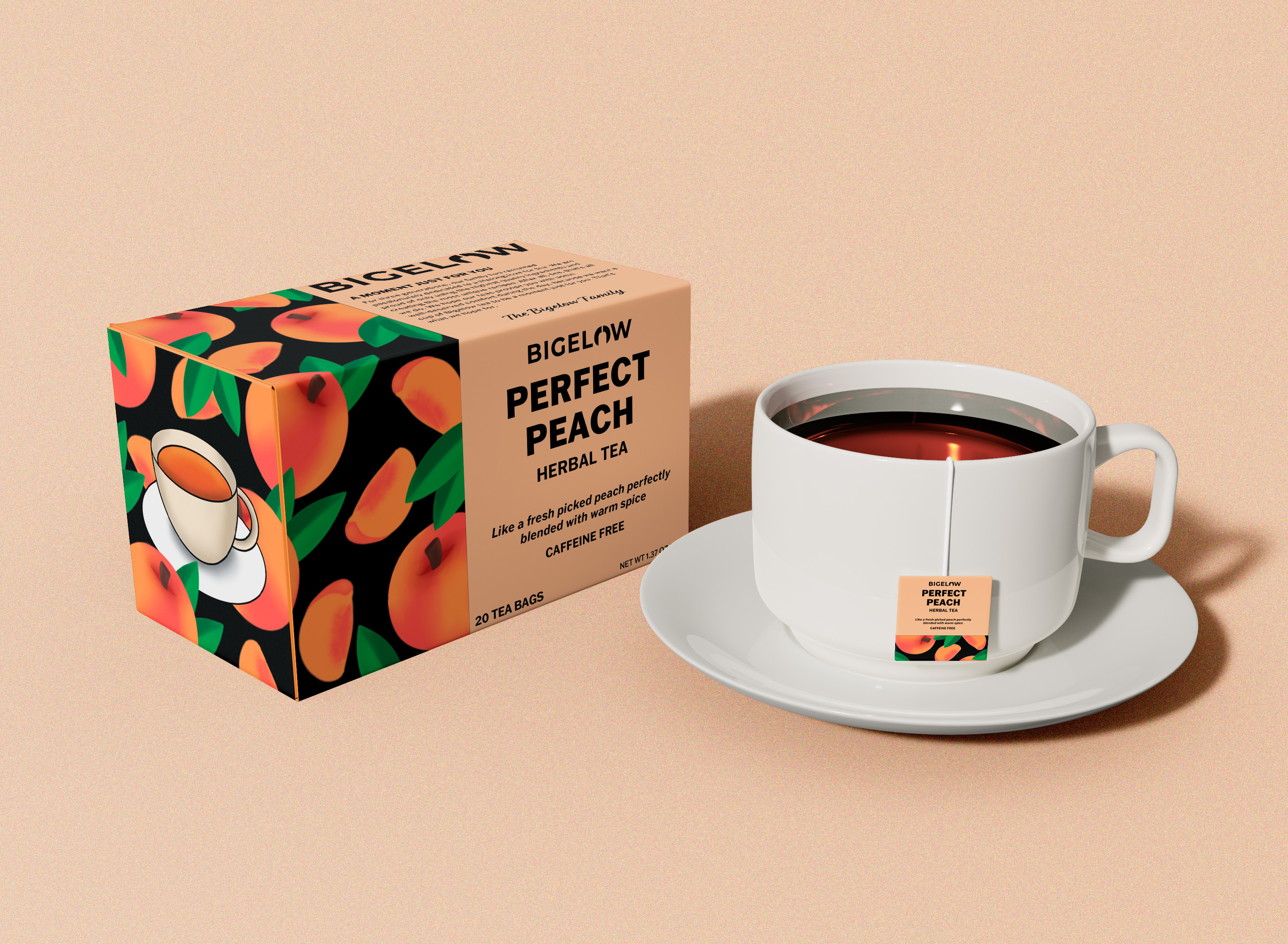
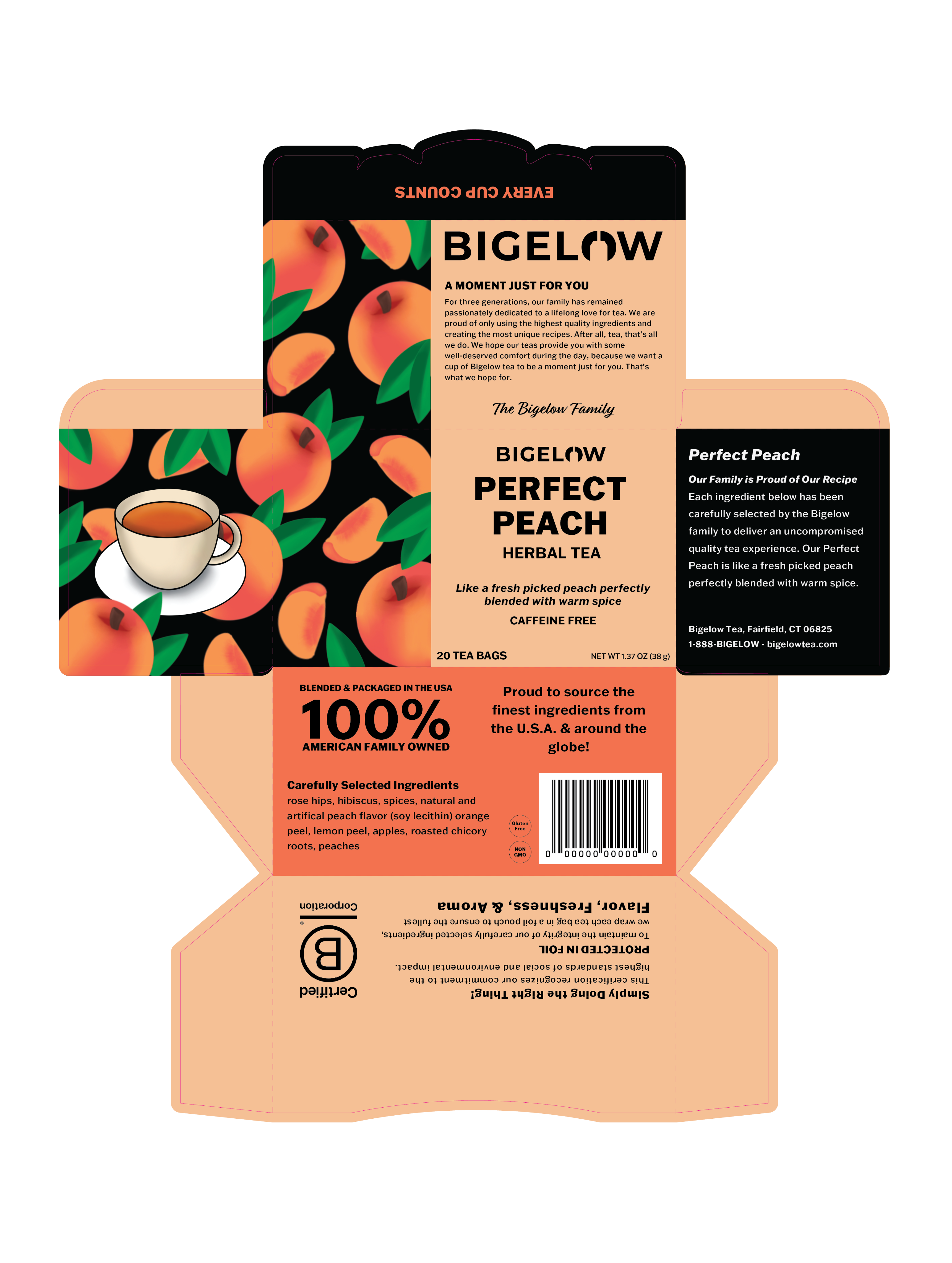
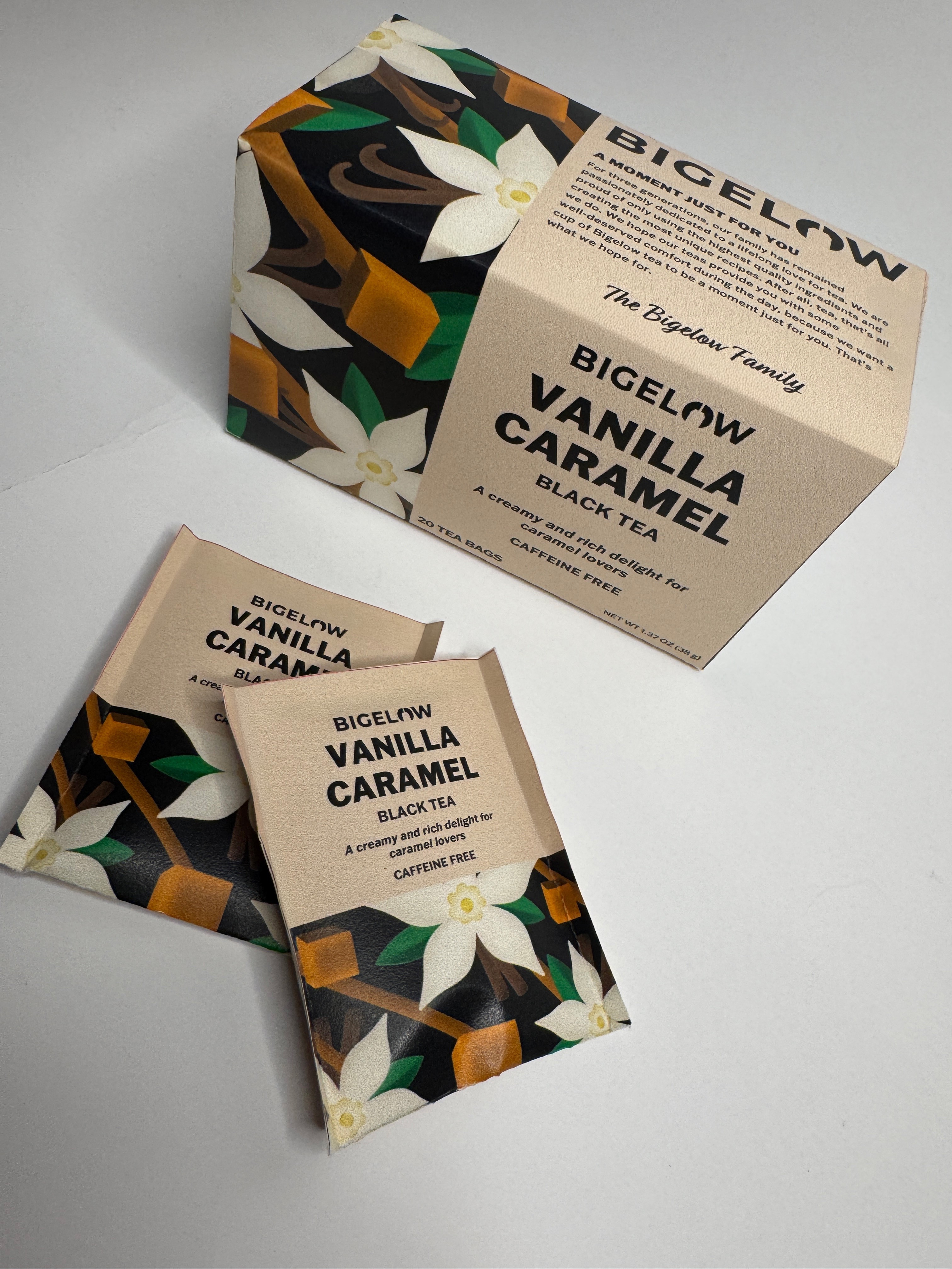
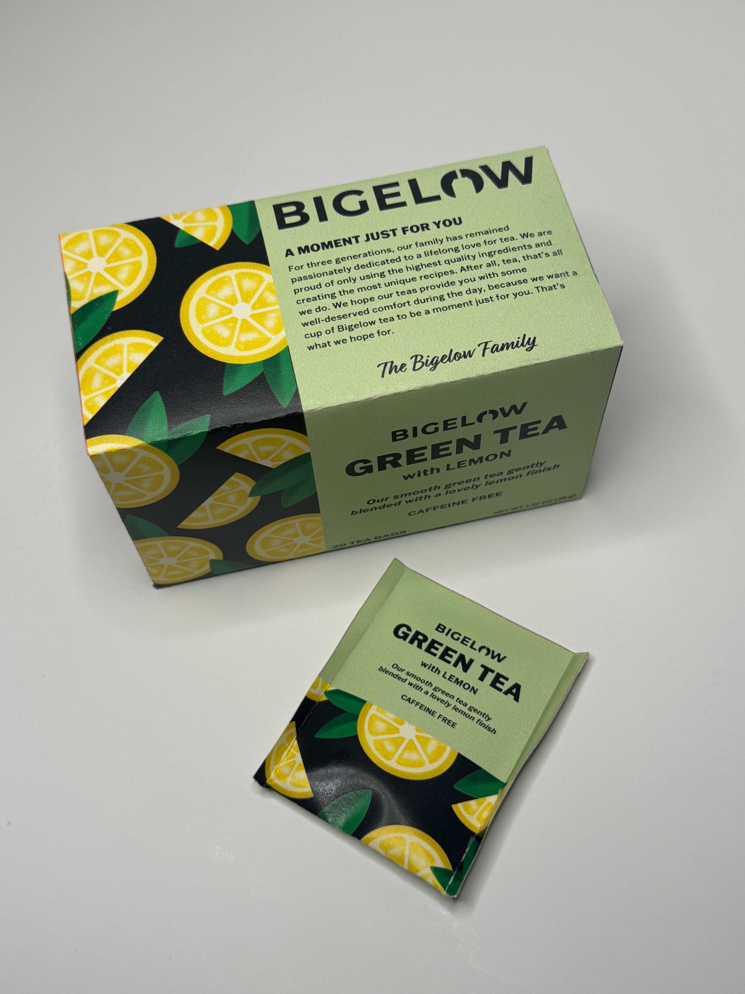
The purpose of Bigelow’s redesigned logo and packaging was to communicate to new and loyal customers that Bigelow will continue to provide the best, high-quality tea no matter its age. Providing a fresh packaging design will revive its roots while staying consistent on its company’s values. Changing their outdated aesthetic will appeal to a more wider audience, especially the younger generation and also gives a chance for the brand to revamp their look for loyal customers.
TOOLS USED
Pencil and Paper
Procreate
Adobe Illustrator
Adobe Photoshop
APPROACH
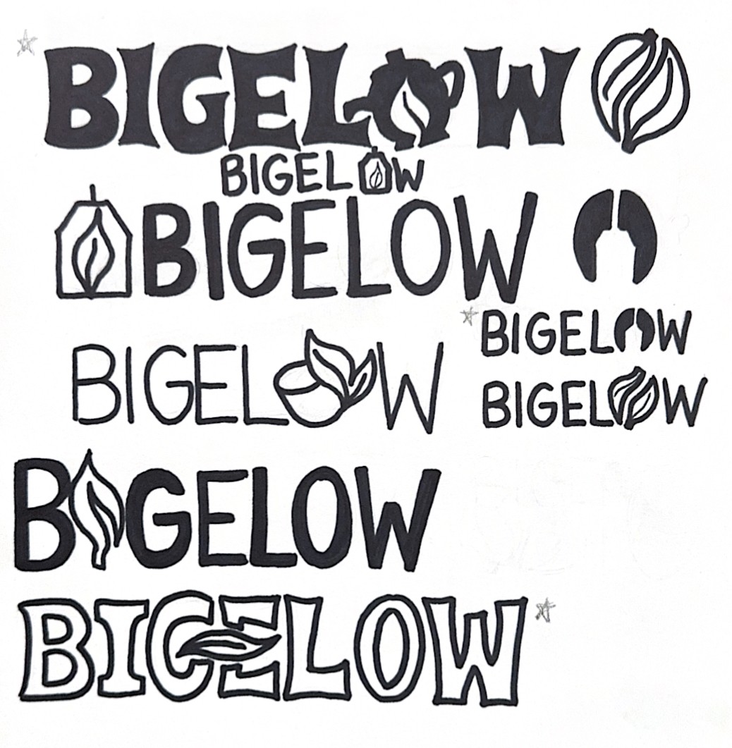
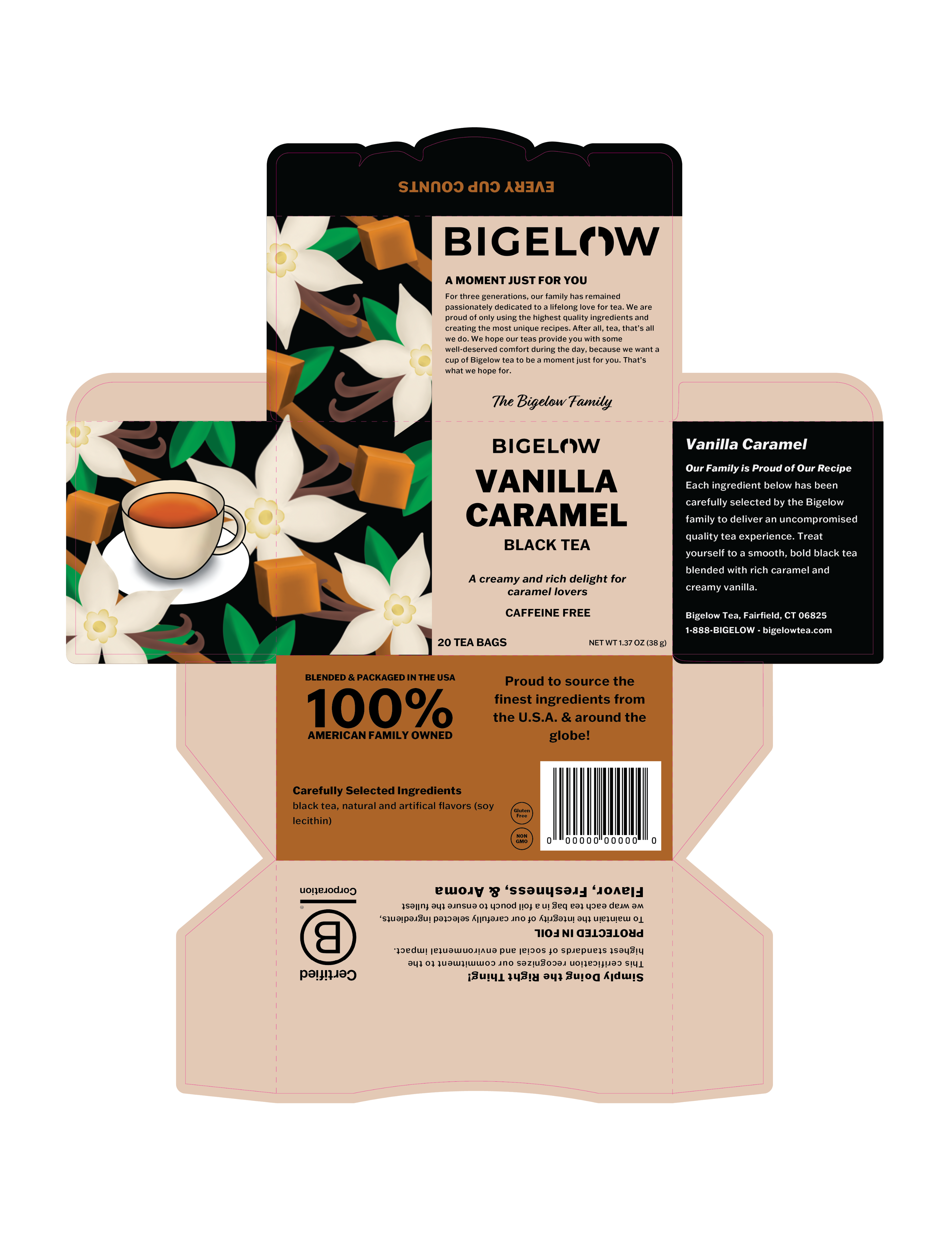
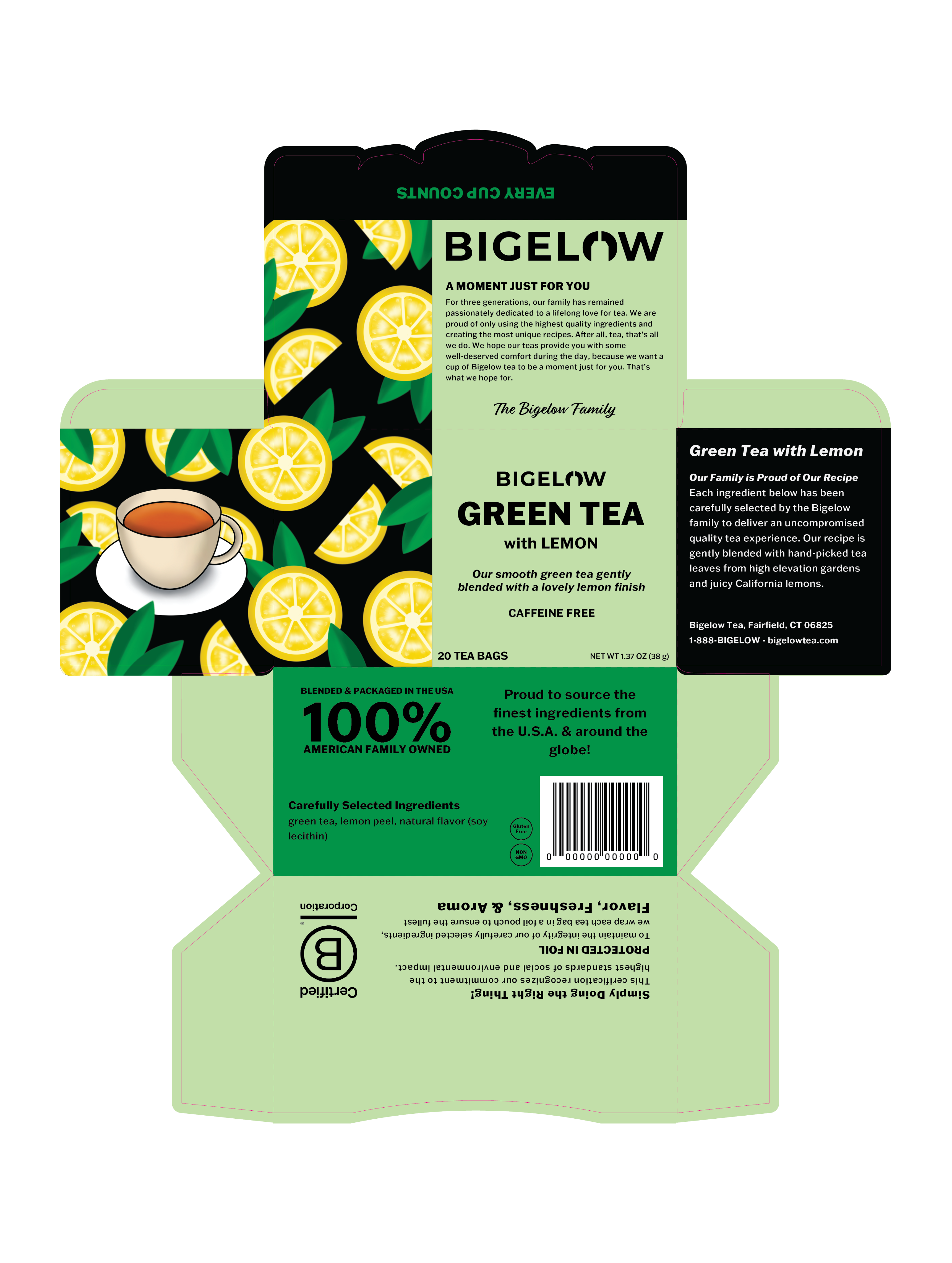
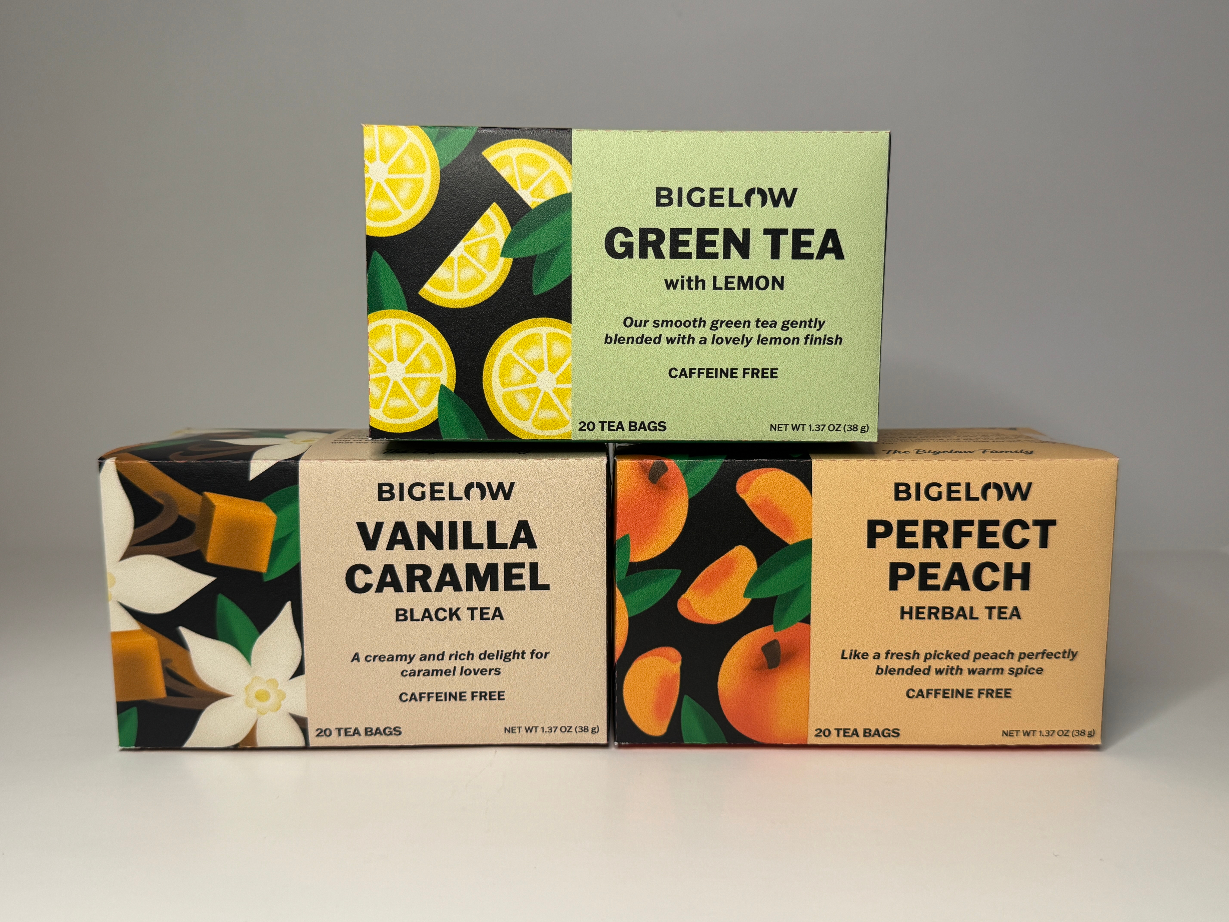
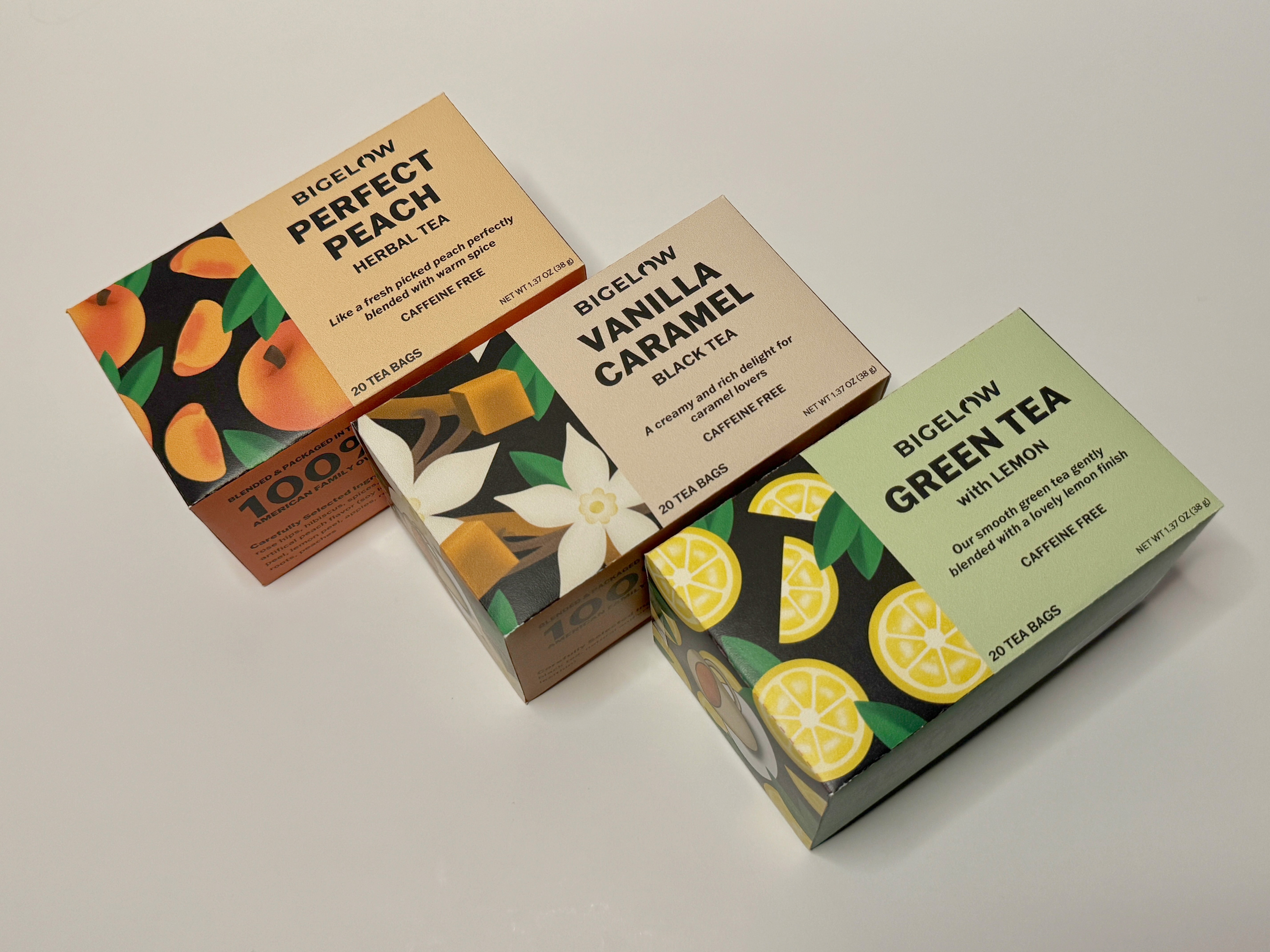
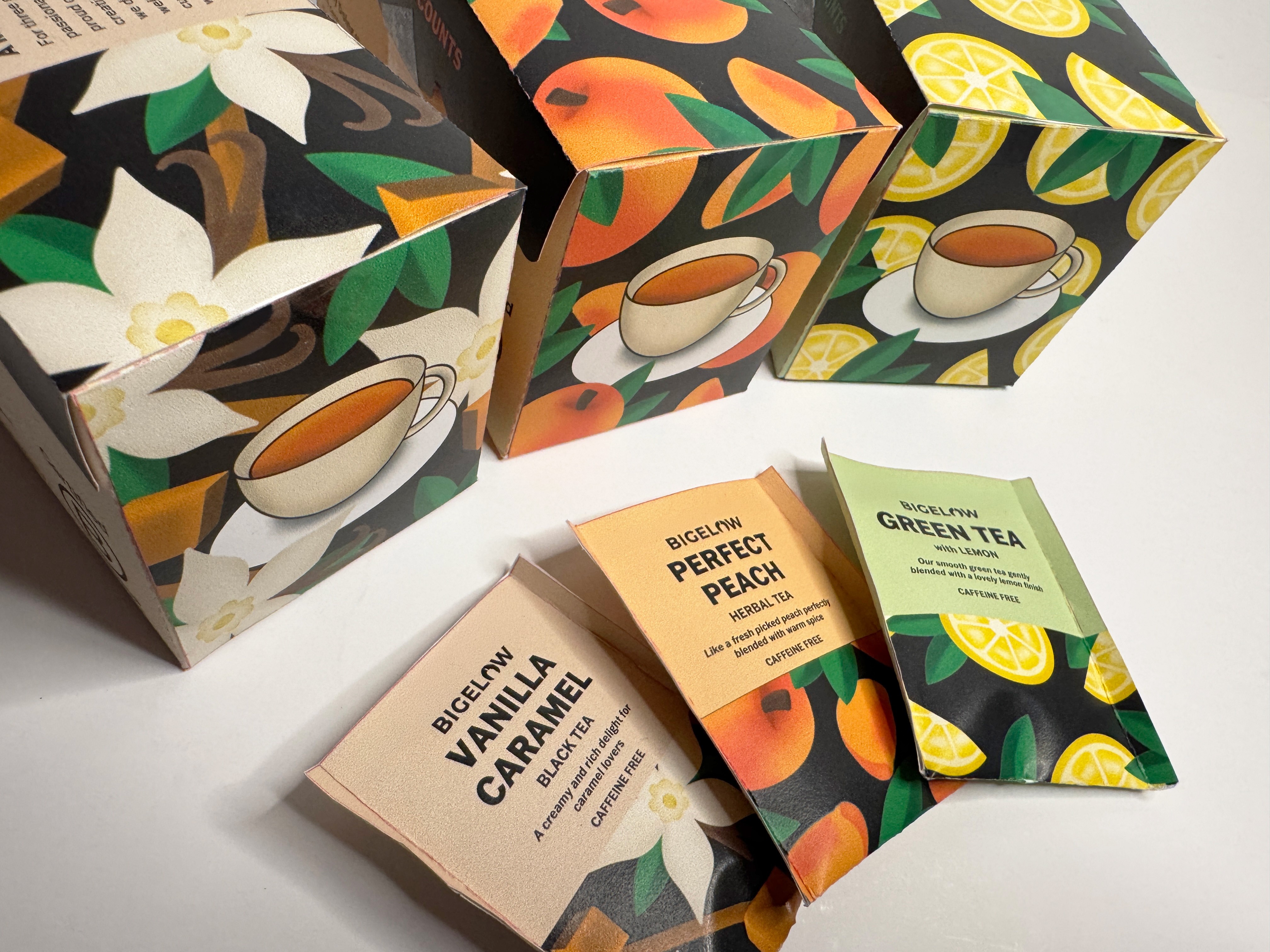
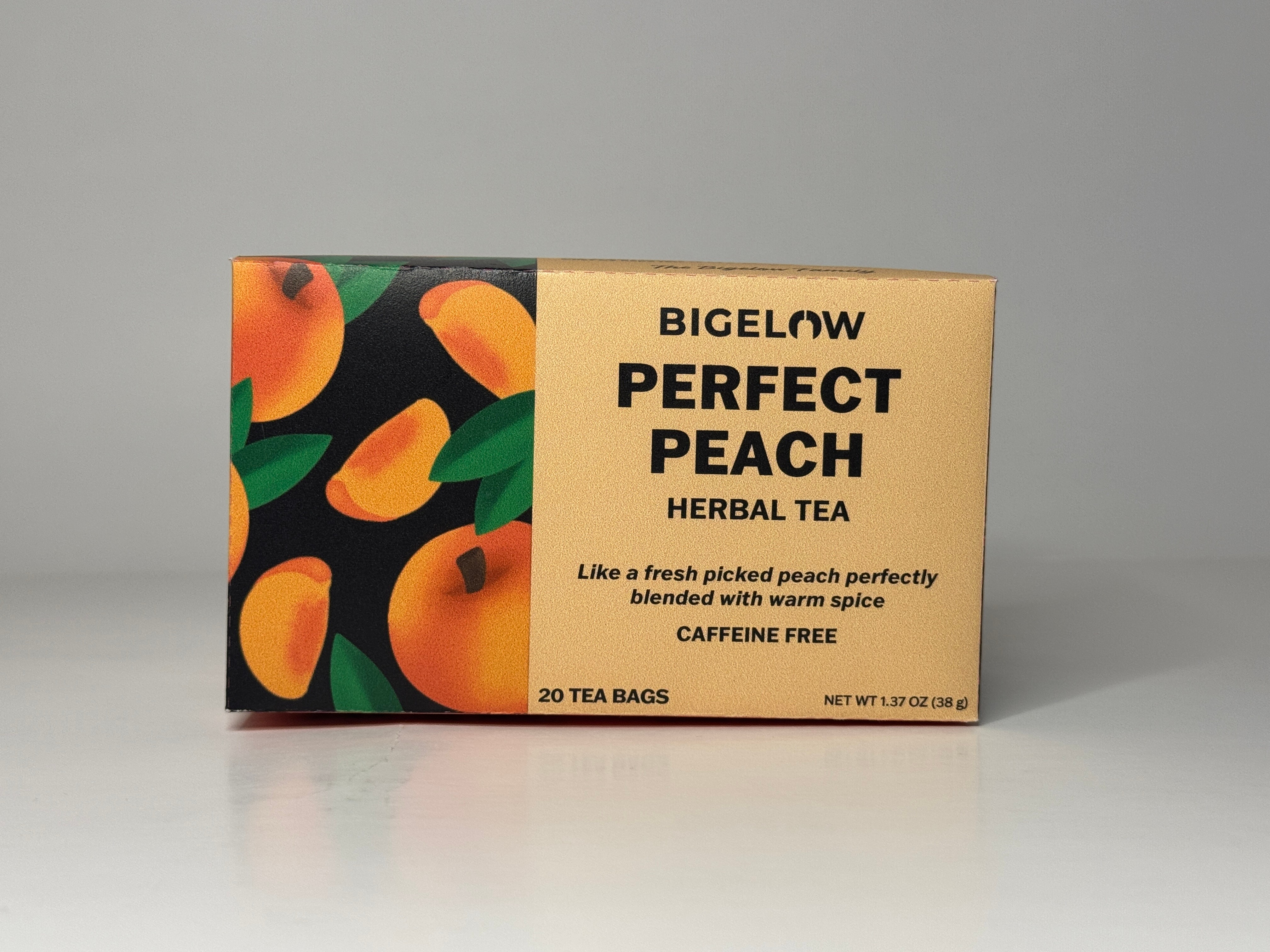
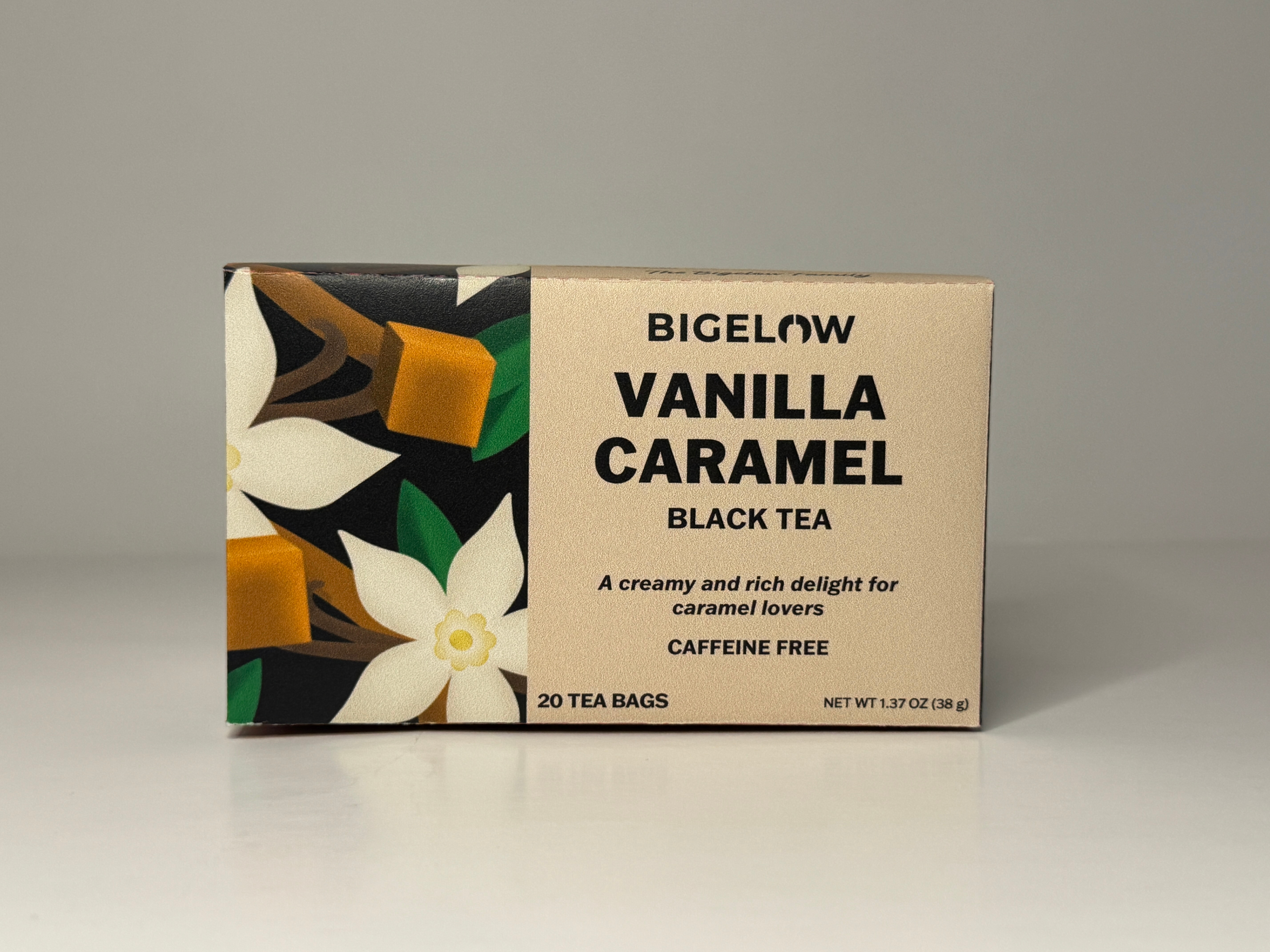
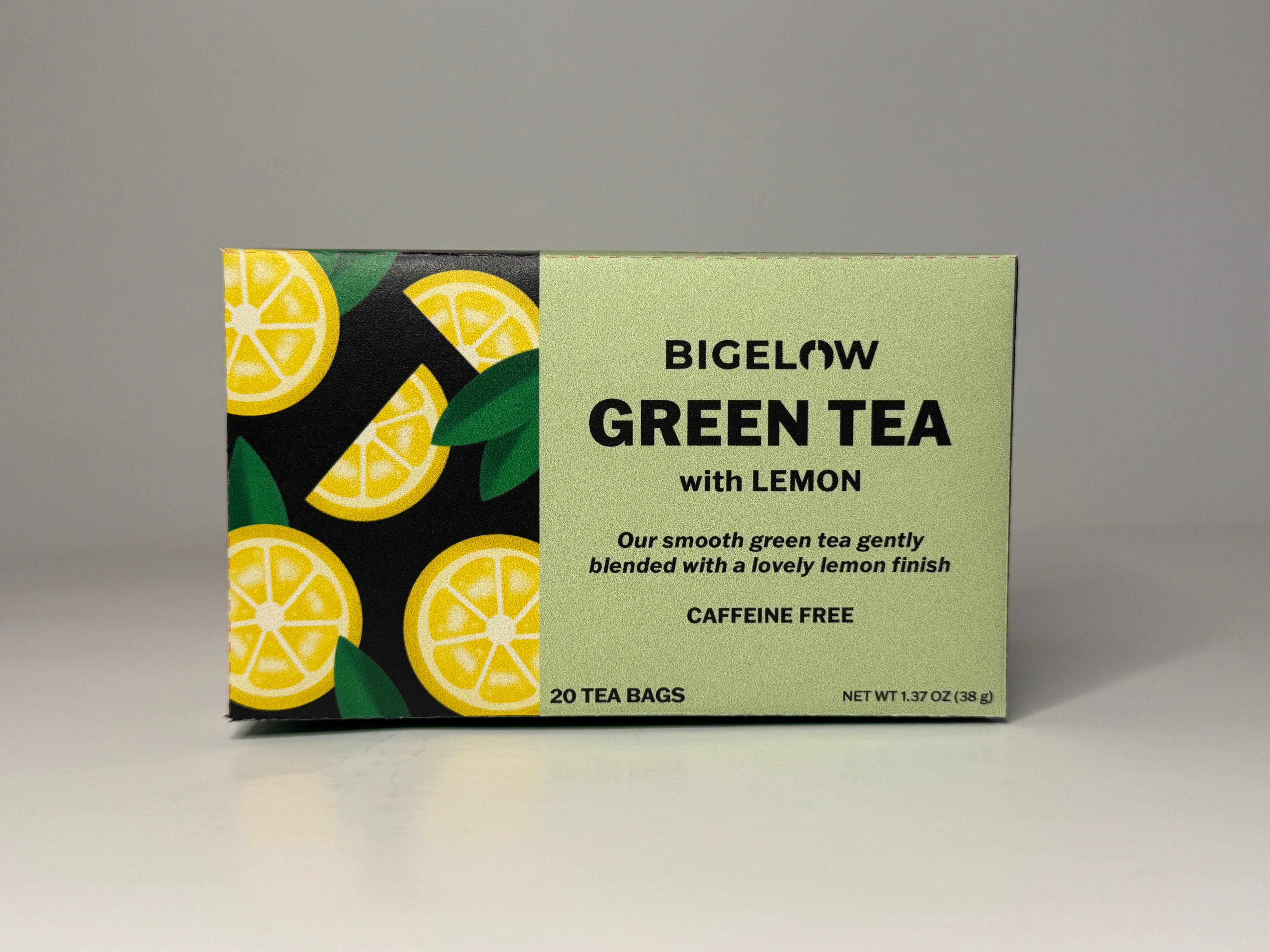
I noticed right away how outdated their packaging looked on the shelves. Their original, serif logo did not work well with the serif typeface they chose for indicating the tea flavor. That was the first main concern I had when trying to redesign a new logo for the brand. The imagery of the front panels also lacked appeal to younger audiences. Instead of staying with realistic imagery, I chose to make illustrations
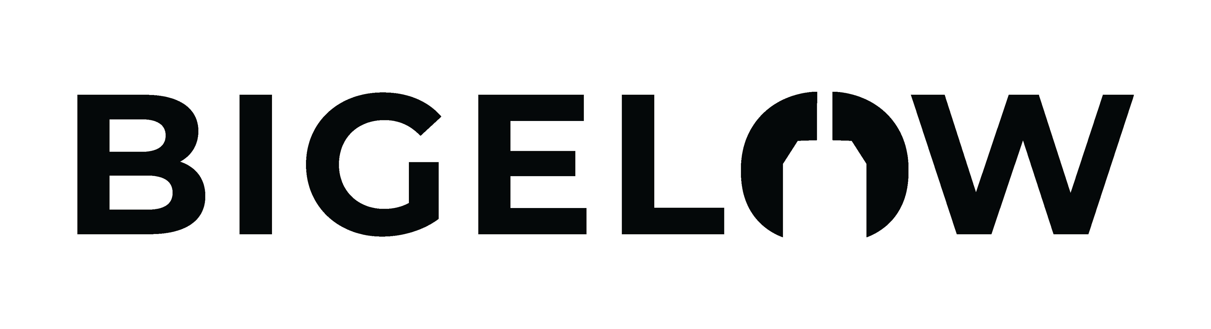
for the flavors instead. The typefaces I chose were both sans serifs and worked wonderfully together. For the new logo I designed, I steered away from the stereotypical teapot and leaf for the “O” and decided to create a tea bag outline using negative space instead to simplify and modernize it. The only challenges I had was figuring out how to create the dielines and making sure they were correct for printing.
SKETCHES
LOGO
PACKAGING DIELINES
PHOTOGRAPHY
ALL WORK
PREVIOUS
NEXT
LET’S GET CREATIVE!
Have inquiries or interested in collaborating? I would love to help design your ideas and make it come to life!
BIGELOW TEA
APRIL 2025
OVERVIEW
Bigelow Tea has stayed true to their heritage by being 100% family owned company. It was founded 80 years ago by Ruth Campbell Bigelow who created their signature tea, “Constant Comment,” which was how the company started. Their product line includes seasonal teas, cold brew, organic, wellness, and immune support teas.
The purpose of Bigelow’s redesigned logo and packaging was to communicate to new and loyal customers that Bigelow will continue to provide the best, high-quality tea no matter its age. Providing a fresh packaging design will revive its roots while staying consistent on its company’s values. Changing their outdated aesthetic will appeal to a more wider audience, especially the younger generation and also gives a chance for the brand to revamp their look for loyal customers.
TOOLS USED
Pencil and Paper
Procreate
Adobe Illustrator
Adobe Photoshop
APPROACH
I noticed right away how outdated their packaging looked on the shelves. Their original, serif logo did not work well with the serif typeface they chose for indicating the tea flavor. That was the first main concern I had when trying to redesign a new logo for the brand. The imagery of the front panels also lacked appeal to younger audiences. Instead of staying with realistic imagery, I chose to make illustrations for the flavors instead. The typefaces I chose were both sans serifs and worked wonderfully together. For the new logo I designed, I steered away from the stereotypical teapot and leaf for the “O” and decided to create a tea bag outline using negative space instead to simplify and modernize it. The only challenges I had was figuring out how to create the dielines and making sure they were correct for printing.
SKETCHES
LOGO
PACKAGING DIELINES
PHOTOGRAPHY
ALL WORK
PREVIOUS
NEXT
LET’S GET CREATIVE!
Have inquiries or interested in collaborating? I would love to help design your ideas and make it come to life!